Software Development
8 minutes reading time

-1.webp?width=1200&name=Axify%20blogue%20header%20(10)-1.webp)
A burndown chart can be a great tool or a misleading one. It all depends on how you use it and what you expect it to tell you. Some companies have gained real value from it, while others haven’t seen the same results.
For example, at a large financial-services company, Agile coaching helped squads use burndown tracking within a structured sprint process. The chart was supported by retrospectives and leadership, so it built visibility and trust in delivery progress.
Another team wasn’t as lucky. Their burndown chart looked perfect, but hid scope creep and late testing. This masked poor delivery behind a smooth trend line.
If you want to avoid these issues, we have the solution for you.
In this article, you’ll see what a burndown chart really measures and why it typically misleads even skilled teams. You’ll also learn how Axify’s value stream metrics offer clear visibility into your delivery flow and outcomes.
But first, let’s take a closer look at what a burndown chart actually is.
A burndown chart is a visual tool that tracks work remaining in a sprint or project over time. You read it by following a simple graph with vertical and horizontal axes.
The vertical axis shows how much work is left, and the horizontal axis shows the time available to complete it. Each day, the chart updates to reflect how much actual work your team has finished against what was planned.
You can watch this short video for a quick visual explanation:
In Agile software development, it’s typically used during sprint planning to help you see if progress aligns with commitments and if adjustments are needed mid-sprint.
There is a problem, though:
A 2024 academic study found that burndown charts (alongside story points) are not always easy to interpret, although widely used by Agile teams. The problem you too might struggle with is transparency and standardization.
That’s why we’ll share more about how to read a burndown chart and better alternatives to it. But first, let’s see:
Let’s look at how burndown charts appear in practice.
In our first example, the vertical axis shows remaining work in hours, while the horizontal axis tracks project length.
The blue “ideal” line represents the perfect delivery pace, and is a reference line for a perfectly even rate of work reduction.
The purple “actual” line shows the pattern of work completion. In other words, the actual line shows how the team’s work pace varied from the ideal steady pace.
For instance, if the actual line stays above the ideal one early on, it means work accumulated or progress was slower in those weeks, while steeper drops later show higher throughput or productivity.
 Source: Motion
In our second example, the chart adds a green “estimated” line. It compares planned completion against real progress to forecast how the rest of the current project will progress based on your team’s actual performance. It updates as new data comes in, showing whether the team is on track to finish the remaining work earlier or later than the ideal pace.

Source: Nulab

A third scenario could be a release-level chart, where weeks appear on the X-axis and story points on the Y-axis. Each dip shows work completed across multiple sprints, which helps you track long-term delivery trends.

These examples make burndown visuals clear, but interpreting them correctly is where real insight begins.
A sprint burndown chart tracks progress within a single sprint, while a release burndown chart measures progress across multiple sprints leading to a release.
In a sprint chart, you monitor user stories or tasks from the sprint backlog against days in the sprint. It helps you see if your team’s pace matches commitments. A release chart, on the other hand, spans several iterations and shows how much scope remains before delivery.
Both use similar axes (time and work remaining), but serve different planning levels. One keeps daily execution visible while the other connects those results to long-term delivery goals.
A burndown chart tracks how much work remaining there is over time, while a burnup chart shows how much work you’ve achieved against the total scope.
Both visualize progress, but they tell the story from opposite directions. In a burndown, the line moves down as tasks finish. Meanwhile, the line rises as completed work accumulates in a burnup.
The difference matters when a scope change occurs. Burndown charts can hide it, but burnup charts make it visible through separate lines for total scope and progress. Each helps you see delivery trends, but burnup provides clearer context when scope shifts mid-project.
You can also watch this quick video for a visual breakdown of how scope changes affect both charts:
Next, let's see the components of a burndown chart in a bit more detail.
Every line and axis in a burndown chart has meaning. Understanding its structure helps you interpret what the data actually says about your team’s delivery pace.
These are the key elements you should know:
Together, these parts turn a simple chart into a structured progress measurement tool. Here's a visual representation of each component:

With that out of the way, let's see how you can create your very own burndown chart.
Creating a burndown chart starts with choosing the right tool and defining what data drives it. You can either build it automatically in a platform like Jira or manually using Excel or other project management tools. Each approach depends on how your team tracks progress, what level of detail you need, and how closely your workflow follows Agile delivery cycles.
Here are the main ways to create a burndown chart, along with the key data inputs that make the chart accurate and useful for ongoing improvement.
The Jira burndown chart is a common option for Agile teams using Jira because it connects directly to your backlog and sprint data. It automatically updates as work is logged and gives you a real-time view of sprint health. Here's how to do it:
Start by defining how your team measures effort (in story points, hours, or another estimation statistic). This metric determines how your team measures effort, which in turn is used to calculate velocity in the long run.
In your Scrum board or backlog, open each issue and enter its estimate. If you adjust estimates or add/remove issues during an active sprint, Jira will display the difference as a scope change. This keeps transparency around rework or shifting priorities.
Once the sprint begins, navigate to your project’s Reports section and open the burndown chart. The red line shows work remaining, while the grey line shows ideal progress. If the red line stays below the grey one, your team is likely on track to meet the sprint goal.

This view is useful when you’re managing multiple sprints under a single feature or release. It shows work added, work completed, and work remaining for the entire epic. It projects completion based on your team’s past velocity.
This approach gives you automated burndown reports that reflect how your sprint evolves without needing manual updates.
If you prefer more control, or your organization doesn’t use integrated Agile tools, a burndown chart in Excel is a solid manual option. It’s based on the same principle but built from your own project data (manually). Here's how to do it:
List all work Items and define total hours or story points for each. Break these estimates down across sprint days. For example, we know that 80 total hours across 5 days equals 16 hours per day if you divide total hours evenly across days..
However, you won’t always do that when building a burndown dataset. You can also use total effort (e.g., 80 hours) to calculate a different ideal daily burn rate.
The “ideal” line may or may not assume even daily progress, but the actual tracking depends on real completion.
Log time spent on each item daily, and update the remaining hours in your spreadsheet. These updates build your core dataset for the chart.
Add a column for real hours worked, so you can track the actual remaining work each day. After all, in true burndown logic, you’re tracking the remaining hours/ work items. Expect differences between estimates and actuals. This helps you identify gaps in estimation accuracy.
Combine estimated and actual totals into a summary table with daily values. This creates the base for your visual chart.
While Excel requires more manual input, it helps you control how metrics are displayed and lets you experiment with formulas or templates for your specific Agile methodology.
Here's a video tutorial on how you can make one in 12 minutes:
To make your burndown chart accurate and meaningful, the key data inputs include:
Without consistent updates to these inputs, the chart loses value as a progress signal. When data is current, you gain visibility into real performance patterns and can address blockers faster during daily standups or sprint reviews.
Moving on, let’s look at how to interpret the lines, trends, and what they say about your team’s flow next.
Reading a burndown chart is about understanding what the lines are actually telling you. Each trend, dip, or plateau represents something in your project cycle. When you read it correctly, you can move beyond reporting progress to diagnosing delivery patterns and acting on them.
Here are the two main elements to pay attention to when analyzing a burndown chart.
As we explained above, most work burndown charts have two lines: the ideal and the actual. However, some tools display only the actual progress.
The ideal line is a straight, diagonal path that represents a perfectly even rate of progress (no blockers, no rework, no added scope). It’s the benchmark that shows what completion would look like if everything went according to plan.
The actual line, however, tells the real story. If it drops slower than the ideal line, that usually signals testing delays, unplanned work, or misestimated tasks. If it’s flat for several days, that might indicate a blocked parent task or dependencies slowing the team down.
When the actual line dips sharply at the end, it usually means most work was completed in a final push rather than spread evenly through the sprint. That insight helps you question progress and efficiency factors like flow distribution and workload balance.
Scope creep or rework shows up when the actual line spikes upward mid-sprint. This means the total effort increased instead of decreased.
A flat or inconsistent line can mean the team spent time on unscheduled work or struggled to close items in the iteration path. Of course, a flat line can also occur during weekends, non-working days, or QA waiting periods.
In contrast, when you notice repeated deviations across sprints or epics, it’s a signal of deeper process instability rather than one-off issues. This is especially true when measured in an epic burndown chart. You can use this as a trigger to look at cycle consistency, test bottlenecks, or missing cross-team visibility.
Burndown charts are primarily used by Agile teams and delivery-focused roles. These are the people responsible for tracking progress, managing flow, and maintaining visibility across a sprint or release. These charts help you compare progress against expectations, spot delivery risks, and plan adjustments in real time.
Here are the key roles that rely on them most frequently:
During daily standups, the burndown chart can act as a shared reference point (though they aren’t mandatory per Scrum Guide). It helps your team quickly gauge whether you’re burning down work as expected or whether scheduled work is falling behind. In sprint reviews, it becomes a retrospective artifact or evidence of how your planning assumptions held up against reality.
A burndown chart remains one of the simplest tools you can use to visualize sprint progress. It usually doesn’t demand deep configuration or complex metrics. You just need accurate inputs and consistent updates. That’s what makes it a go-to reference point for Agile teams that want a quick, shared understanding of where their sprint stands.
Here are the main reasons why burndown charts continue to be used across Agile environments.
Burndown charts work because they make effort and time visible. With one glance, you can see whether progress is tracking toward completion or lagging behind. The simplicity of the downward slope makes it intuitive for anyone to interpret.
It also allows for quick feedback loops. For example, when the chart flattens, teams can check immediately if flow is genuinely disrupted or something else occurred (e.g., free day, QA).
A study on sprint management supports this, noting that burndown charts are among the most-used features for tracking sprint progress and pace. The goal, as the research points out, is to continuously reduce remaining effort and maintain steady visibility of work pace. That visibility builds accountability and helps everyone align around progress expectations.
Burndown charts are built into nearly every modern delivery tool, from Jira and Azure DevOps to ClickUp. Once your sprint data and estimation method are set, the chart generates automatically. You don’t have to design complex dashboards or manually refresh data.
Because setup is so straightforward, it supports adoption across multiple teams and functions. You might use it to guide retrospectives, facilitate sprint reviews, or report progress to leadership. The burndown chart provides a common, fast, and universally readable baseline for understanding sprint performance.
Burndown charts make sprint progress visible, but that visibility is narrow. They tell you how much work remains and not how well the system delivers. As projects scale, that lack of depth becomes a major gap.
Here are the main limitations that usually make burndown charts misleading in complex delivery environments.
A burndown chart shows effort burned down (story points or hours), but it doesn’t track delivered value. Work might be completed, yet if the feature doesn’t impact the customer or business goal, the chart still drops as if everything’s on track. That disconnect creates the illusion of productivity without verifying impact.
Remember: Agile teams aren’t meant to use burndowns for measuring value. So we admit that this “limitation” is context-dependent: it’s true only if teams misinterpret burndown charts as a value metric.
The chart can’t show why work slows down. If QA is overloaded or reviews pile up, the burndown simply flattens without context. You see the symptom but not the cause. Teams that depend on these charts alone typically miss systemic issues until delivery is already at risk.
Because the chart rewards visible burn, teams sometimes prioritize finishing “easy points” over real value delivery. It can also lead to inflated estimates or skipped testing to make the line drop faster. Over time, that distorts team performance data and undermines trust in metrics.
Of course, this is behavioral, not inherent to burndown charts.
A burndown chart shows what has already happened, but not what’s about to go wrong. By the time the line flattens, the sprint is typically too far along to fix course. This way, you’re reacting rather than managing proactively. But here's what you need to know:
And that’s exactly where visibility breaks down. Real delivery control requires understanding flow stability instead of just the rate of effort burned.
Burndown charts show effort over time, but they stop short of explaining why delivery slows or where flow breaks down. Value stream management (VSM) shifts the focus from counting points to understanding how value actually moves through your delivery system. With Axify, that shift becomes measurable and actionable.
Here’s how it changes what you see and how you decide.
Axify's value stream mapping tool brings together data from your delivery tools (Jira, GitHub, Azure DevOps, and more) to show the full path from idea to release. You'll see completed tasks and every stage of the flow, from backlog to deployment.
Each step becomes visible in context, which helps you connect handoffs, blockers, and throughput patterns across teams. That visibility makes it easier to manage work holistically rather than react to symptoms late in a sprint.
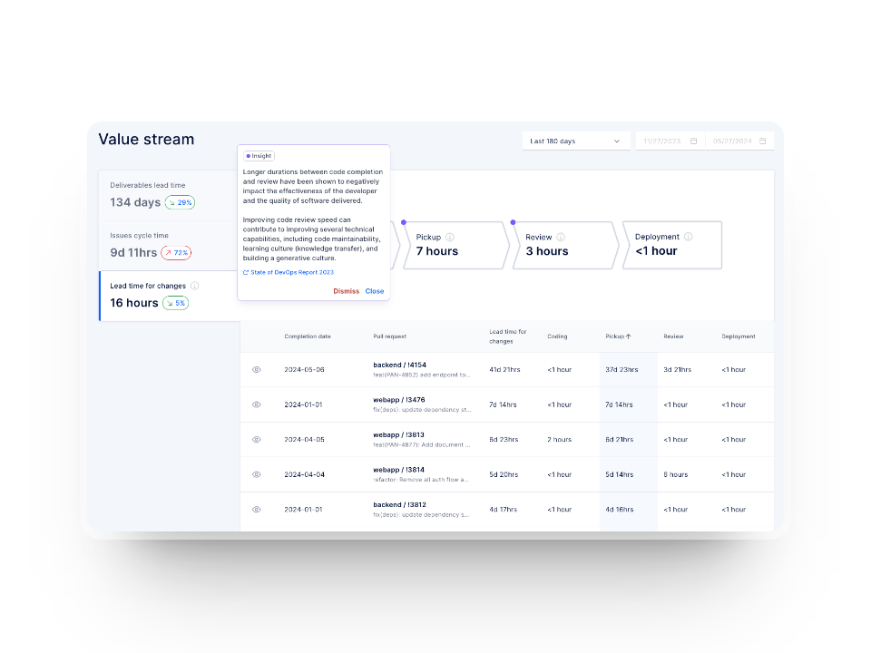
Instead of tracking effort burned, Axify measures flow stability, throughput, and delivery consistency across sprints. It shows you how long work items spend in each stage, where queues build, and when flow efficiency drops.
Those insights let you see delivery performance as a system rather than a set of isolated metrics. With it, you can act early, long before a flat burndown line would ever signal a problem.

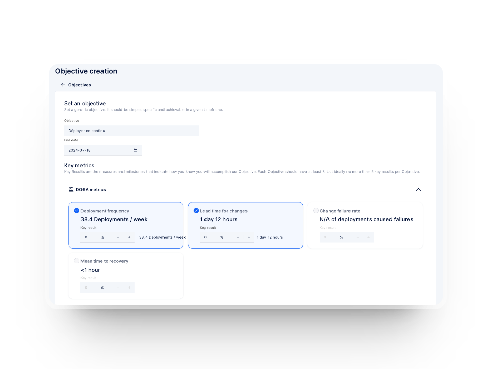
With built-in alignment to OKRs and outcome metrics, Axify links your delivery performance to business impact — showing whether your changes truly accelerate value delivery to users.
That’s where burndown charts stop. However, value stream insights keep going to show you how engineering work translates into measurable value. In other words, VSM turns reporting into diagnosis and opportunities, and that’s what modern delivery leadership actually needs.
Axify helps you move past the limitations of burndown charts. It turns delivery data from your existing tools into real-time visibility across the entire value stream. Here’s how Axify changes what you can measure, predict, and improve.
Axify connects directly with your delivery tools, so data flows automatically. You no longer have to build manual reports or chase updates. The dashboard updates in real time and gives you a single, unified view of commits, pull requests, deployments, and sprint activity. That means your data is accurate and continuous.
Instead of tracking only work done, Axify measures how work flows.
Together, these signals give you a more complete picture of team performance and delivery sustainability.

Axify’s software delivery tracker shows when delivery trends start drifting off course. At the same time, the daily digest keeps you aware of aging tasks that may block flow later.
Both tools help you catch risks before they affect sprint outcomes. The visualized value stream lets you pinpoint exactly where work is stuck and where opportunities exist to improve flow efficiency.

With Axify’s OKR tracker, delivery data connects directly to measurable business results. You can see how changes in flow stability or throughput affect strategic goals. It turns operational signals into actionable business insight. This bridges the gap between engineering performance and organizational outcomes.
Axify replaces static progress charts with continuous, connected delivery intelligence. This way, you can manage flow instead of just watching effort burn down. Book a demo with Axify today to see how real-time delivery insight transforms your workflow.
Agile teams use burndown charts to track how much work remains within a sprint or release. They help visualize progress at a glance by showing whether delivery is on pace with the planned scope.
Burndown charts help in sprint planning by giving you historical data on how fast work was completed in past sprints. That data supports better estimation of capacity and scope for upcoming iterations.
Common mistakes include tracking hours instead of completed stories, ignoring scope changes, or using the chart as a performance metric rather than a delivery signal. These habits distort progress and make the chart unreliable for decision-making.
The modern alternative to burndown charts is value stream management. Tools like Axify replace point-based tracking with flow metrics by showing you stability, throughput, and delivery risks in real time. This approach shifts your focus from “how much work is done” to “how effectively value moves through your system.”