DORA Metrics
21 minutes reading time


DORA metrics are five indicators that provide objective data to measure development team performance and drive software product improvement. That’s because they help developers continuously improve their practices, deliver software faster, and ensure stability.
In this article, you’ll understand how DORA metrics connect to real delivery performance, what each metric actually measures, and how to use them to guide decisions.
Pro tip: Axify’s AI decision layer connects your DORA metrics to real workflow data, so you can see what is slowing delivery and get recommendations on what to change next. Contact Axify to see how you can move from metrics to clear, actionable decisions.
We updated this guide to reflect how you build and operate software in AI-driven systems. The original DORA model focused on commits, pipelines, deployments, and incident recovery. However, AI changes your workflow, from the practices you implement to where delays and failures appear. For example, a pull request can pass CI, yet fail after a model or data change in production.
As a result, you need to track how these new practices and challenges affect your system’s throughput and stability. In 2026, we adjusted our previous info to help you diagnose issues faster and adjust your delivery process with confidence.
DORA is an acronym for DevOps Research and Assessment. This Google research group actively studies what differentiates a high-performing DevOps team from a low-performing team.
Since the early State of DevOps reports starting in 2013, DORA has analyzed data from tens of thousands of professionals across multiple years. From this research on their DevOps practices, they defined four key metrics to measure software delivery performance: deployment frequency, lead time for changes, change failure rate, and mean time to recovery.
In addition to an official DevOps report published annually, the team also released a white paper on the ROI of DevOps transformation, as well as the book "Accelerate: The Science of Lean Software and DevOps: Building and Scaling High Performing Technology Organizations," co-authored by Dr. Nicole Forsgren, co-founder of the DORA team and current partner at Microsoft Research.
Since there are many frameworks and methodologies to improve the way development teams build software products and services, DORA wants to shed light on what works and what doesn't in a scientific way.
DORA metrics give you a clear view of delivery speed and stability. Here are the key metrics:
At a high level, failed deployment recovery time and lead time for changes measure speed, while change failure rate and deployment frequency measure stability. A team can achieve better business results by measuring these metrics and continually iterating to improve them.
In 2025, the DORA team added a fifth metric, rework rate, to the factors impacting organizational performance. In this post, we will cover all of them.
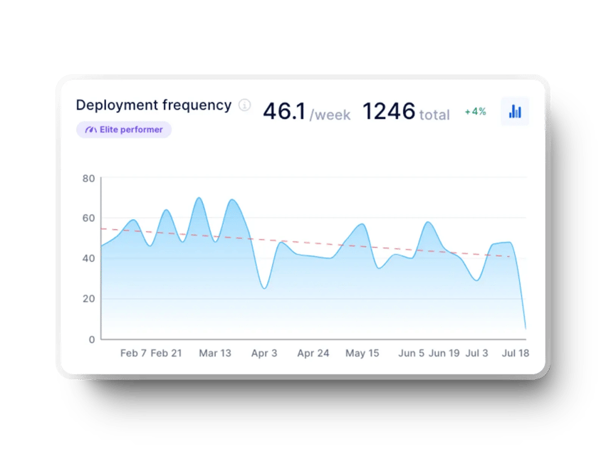
As the name suggests, deployment frequency refers to the frequency of releases. It measures how often a team deploys code into production.
Deployment frequency reflects how smoothly your pipeline moves from merge to release. The table below shows how frequently most teams deploy:
| Deployment Frequency | % of teams at that level |
% of teams at or above this level |
| Fewer than once per six months | 3.6% | 100% |
| Between once per month and once every six months | 20.3% | 96.4% |
| Between once per week and once per month | 31.5% | 76.1% |
| Between once per day and once per week | 21.9% | 44.6% |
| Between once per hour and once per day | 6.5% | 22.7% |
| On demand (multiple deploys per day) | 16.2% | 16.2% |
Source: DORA 2025 Report
Deployment frequency, as the name implies, measures the number of deployments the team makes in a given period (e.g., by month, week, or day). Hence, a high deployment frequency is a good indicator of the team's ability to push code to production.
But a stable deployment frequency (i.e., a regular deployment rate) can reflect an Agile team delivering value continuously. That reduces the feedback loop, an invaluable benefit to the team and the users.
Low deployment frequency typically points to friction in your delivery pipeline that slows down how often code reaches production. To understand what is holding releases back, here are the most common causes:
Regardless of where your team falls on the chart above, here are some ways to improve:
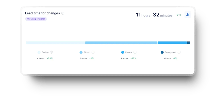
This indicator measures the time between the first commit and deployment to production. We use it to understand the team's cycle time better and analyze its responsiveness to constantly changing user requests and needs. The shorter the time required to make changes, the more responsive the team is and the faster it adds value.
To measure lead time for changes, we need two pieces of data: the exact time of the first commit and the exact time of the deployment in which it was made. We then use the average duration as a performance indicator. This means teams with better delivery performance can go from commit to production delivery in less than a day.
The table below shows how teams are distributed across different lead time ranges and where most fall.
| Lead Time for Changes | % at level | % of teams at or above this level |
| More than six months | 2% | 100% |
| Between one month and six months | 13.2% | 98% |
| Between one week and one month | 28.3% | 84.7% |
| Between one day and one week | 31.9% | 56.4% |
| Less than one day | 15% | 24.4% |
| Less than one hour | 9.4% | 9.4% |
Source: DORA 2025 Report
Lead time for changes indicates how quickly a team delivers changes to users. It represents flow efficiency, code complexity, and team capacity. Shorter delivery times are preferable, as they allow for a faster feedback loop on what you develop and for quick fixes.
There are many reasons for delayed deployments, including fear of deployment failure or rejection of partial delivery. In our experience, when teams hesitate, they tend to batch changes and delay releases. Lead time makes this visible. It gives teams a clear view of how long changes actually take and helps identify where flow slows down, especially across multiple teams or projects.
This metric is also handy for companies or managers tracking multiple contexts or teams, as it creates a consistent way to measure delivery speed. It helps leaders understand how work flows in each context, identify where delays occur, and track improvements over time.
High lead time for changes usually means work is waiting too long between steps in the delivery flow. From our experience, the factors below are the most likely to cause those delays:
Regardless of where your team falls on the chart above, here are some ways to improve:
Tip: Look at your delivery process and identify where automation can remove friction. From our experience, reducing manual steps, especially in testing and deployment, speeds up delivery. Address technical debt gradually and break work into smaller, well-defined items. Together, these changes help reduce lead time for changes.
This metric captures the percentage of changes made to a code that subsequently resulted in incidents, rollbacks or any other type of production failure. According to the DORA report, the best-performing companies fall around 5%.
The tricky part for most teams is defining an "incident". It can be system unavailability (partial or complete), unusable functionality, a critical bug, a major bug, or any bug.
According to DORA, these are changes to production or user releases that result in service degradation (e.g., lead to service impairment or interruption) and then require corrective action (e.g., hotfix, rollback, fix forward, or patch).
A definition that is too broad or too restrictive could be detrimental to the team, and the answer is highly dependent on your team's context.
Change failure rate varies across teams. Here’s how teams are distributed across failure rate ranges, according to the 2025 DORA report:
| Change Failure Rate | % at level | % of teams at or above this level |
| 0%–2% | 8.5% | 8.5% |
| 2%–4% | 8.1% | 16.7% |
| 4%–8% | 19.6% | 36.2% |
| 8%–16% | 26% | 62.2% |
| 16%–32% | 19.5% | 81.6% |
| 32%–64% | 12.5% | 94.1% |
| >64% | 5.9% | 100% |
Source: DORA 2025 Report
CFR is an indicator of code quality and stability. This metric shows the percentage of changes made that result in an incident. As mentioned earlier, the type of incident considered for this metric is specific to each team.
You should measure the change failure rate in your team to detect any problematic increases over a longer period.
That’s because a high failure rate implies an increase in the time spent reworking existing features. If you’re spending more and more time on rework, you are allocating less time to deliver new value to users.
Side note: While not a time metric per se, the failure rate of changes can also have significant implications on your ability to create value quickly.
A high change failure rate usually points to issues in how changes are tested, reviewed, or released into production. Here are the main causes.
Regardless of where your team falls on the chart above, here are some ways to improve:
Tip: From our experience, teams that deploy a few changes will see fewer incidents, but that doesn't necessarily mean they are more successful with the changes they deploy. Teams that deploy frequently may see more incidents in the same time period. But if they keep a low change failure rate, they still outperform by delivering faster and recovering quickly.

Failed deployment recovery time measures the time it takes for a service to rebound from an incident or service degradation. In the original DORA report from 2014, this metric was called mean time to recover (MTTR).
Remember: In our experience, unexpected outages or incidents will occur no matter how well a team performs. And since we cannot avoid incidents, it's really the time it takes to restore or recover a system or application that makes the difference.
Recovery time varies widely across teams, which makes it important to understand existing benchmarks:
| Failed Deployment Recovery Time | % at level | % of teams at or above this level |
| More than six months | 1% | 100% |
| Between one month and six months | 4.9% | 98.8% |
| Between one week and one month | 9.4% | 93.9% |
| Between one day and one week | 28% | 84.5% |
| Less than one day | 35.3% | 56.5% |
| Less than one hour | 21.3% | 21.3% |
Source: DORA 2025 Report
Failed deployment recovery time indicates a team's response time and the development process's efficiency. We encourage you to track this metric because it gives you important insights regarding your throughput.
When it is low, it demonstrates that a team responds and resolves issues quickly to ensure product availability and functionality.
In addition, the ability of a team to recover quickly can positively impact users' confidence levels and make managers more comfortable with experimentation. This is a big competitive advantage!
The reverse is also true. If recovery time increases over time, it signals growing friction in your delivery process. It may point to slower detection, unclear ownership during incidents, or more complex changes that are harder to roll back.
Tracking this trend helps you identify where recovery slows down and take action early, before it affects reliability and delivery speed.
High recovery time usually means the system struggles to isolate and resolve issues after a failure. Here are the potential causes you might come across:
Regardless of where your team falls on the chart above, here are some ways to improve:
Tip: We believe you should balance speed and stability! Allow your team to slow down sometimes to achieve better performance by reducing the work in progress (WIP). Avoid putting sudden changes into production at the expense of a quality solution.
Rather than deploying a quick fix, ensure the change you make is sustainable and tested. Then, track failed deployment recovery time to see how your team is improving and aim for steady, stable growth.
Rework rate appears in the DORA 2025 report, where it is defined as the percentage of deployments that are unplanned and triggered by incidents in production.
You can use it to understand how much delivery capacity is spent correcting problems instead of delivering new functionality.
Recent DORA data presents rework rate as a distribution across teams, showing how much delivery effort is spent on unplanned fixes. The table below shows how teams are spread across different rework levels:
| Rework rate | % at level | % of teams at or above this level |
| 0%–2% | 6.9% | 6.9% |
| 2%–4% | 5.8% | 12.8% |
| 4%–8% | 13.7% | 26.5% |
| 8%–16% | 26.1% | 52.6% |
| 16%–32% | 24.7% | 77.3% |
| 32%–64% | 15.4% | 92.7% |
| >64% | 7.3% | 100% |
Source: DORA 2025 Report
The core delivery metrics above show how fast and stable your system is. Rework rate complements them by showing how much of your output is avoidable.
For example, two teams may deploy at the same frequency, but if one has a higher rework rate, more of its deployments are fixes rather than new value.
DORA 2025 data shows that many teams fall in the 8%–32% rework range, meaning a significant portion of delivery effort is spent on corrections.
High rework rate usually points to issues earlier in the delivery process:
Reducing rework rate means preventing issues before they reach production:
Each DORA metric shows one part of your delivery system, so on its own, it can’t explain performance changes. You need to read them together to understand how your delivery actually behaves.
Frequent deployments suggest fast flow through your continuous integration/ continuous delivery pipeline. However, if a high percentage of those deployments trigger incidents or rollbacks, the system becomes unstable.
This pattern means code moves quickly from pull request to production, but validation steps are weak or rushed. As a result, teams spend more time reacting to failures than progressing planned work. In practice, this reduces software delivery success, even if output appears high.
In this case, code and changes move quickly from commit to production, but deployments still happen infrequently. This usually means the delivery pipeline is efficient, but releases are intentionally delayed.
The bottleneck is not in development, review, or testing, but in how and when deployments are triggered. Teams may batch multiple completed changes into scheduled releases, wait for approvals, or follow fixed release windows.
As a result, even though individual changes are ready quickly, they do not reach users immediately. This slows down feedback, increases batch size, and reduces the benefits of a fast delivery pipeline.
Finally, a low failed deployment recovery time combined with a high failure rate shows a different tradeoff. Recovery processes work well, so incidents are resolved quickly. However, frequent failures still indicate issues in how changes are introduced.
For example, a team may deploy frequently with limited validation, relying on fast rollback and strong incident response to handle failures. When a deployment causes issues, it is quickly reverted or patched, which keeps recovery time low. But because failures happen often, the system remains unstable.
This creates a setup where teams handle failure efficiently but introduce too many failures in the first place.
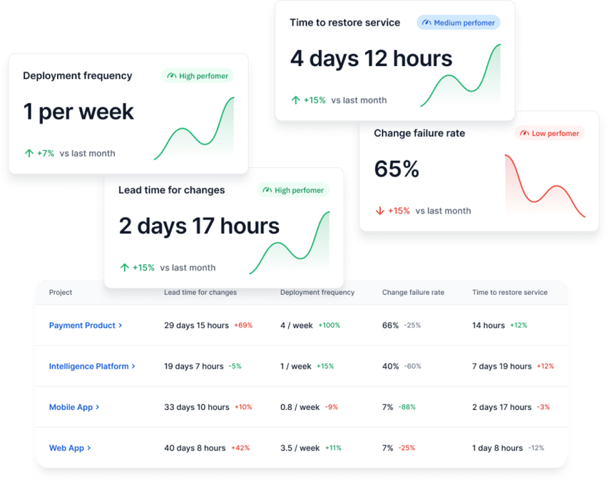
Tracking DORA metrics helps you understand your system’s delivery stability and throughput. Here are the key benefits that stem from that.
To improve, you need to understand your starting point and also have a clear goal to achieve. DORA metrics give development teams concrete goals, which you can break down into key objectives. When you know what data to track over time, your team can adjust their behavior to improve the metric on their end, which will impact team and process efficiency.
Changes in DORA metrics help you identify where to focus improvement efforts in the delivery process and highlight issues such as ineffective testing.
DORA metrics are based on large-scale, up-to-date research. Because the five metrics are interrelated, they are harder to manipulate in isolation, which provides a more accurate picture of your performance.
They also allow you to compare your results to industry benchmarks in a meaningful way, helping you identify improvement opportunities and make informed decisions without turning comparisons into competition between teams.
Companies that streamline their development and delivery processes increase the value of the software they build and perform better in the long run. Tracking DORA metrics allows teams to base those delivery decisions on concrete data.
In addition, DORA metrics help you align your development and business goals. For example, improving deployment frequency supports faster feature delivery, while reducing recovery time helps maintain service reliability.
From a product management perspective, these metrics give you visibility into how quickly teams can deliver changes and respond to issues. As a result, you can set realistic expectations and better meet customer needs.
In recent years, value stream management has become essential to software development. In this context, DORA metrics are indispensable, as teams that measure themselves tend to improve continuously. So when DevOps teams use DORA metrics, they typically see an increase in value over time.
As a set of proven DevOps benchmarks that have become the industry standard, DORA metrics provide a foundation for this process. They identify points of inefficiency or waste.
You can use this information to streamline and reduce bottlenecks in your workflows, such as deconstructing the lead time for changes in steps to observe where the process is stuck. When your team's DORA metrics improve, the efficiency of the entire value chain improves with them.
In addition, DORA metrics allow you to measure and improve yourself to ultimately:
DORA metrics also provide insight into team performance. For example, looking at the change failure rate, and deployment rework rate tells engineering managers whether their teams are building great products with minimal downtime and avoiding repeated corrective work.
Similarly, tracking deployment frequency and lead time for changes assures that the team is working quickly. Together, these metrics tell you whether your team has reached a good balance between speed and quality.
Comparing these five key DORA indicators to existing benchmarks also helps.
For example, let’s say your team’s failed deployment recovery time is less than a week with weekly deployments. However, their change failure rate is high. In that case, your team may be rushing deployments while lacking automated testing, or they may be unable to support the changes they are deploying.
If deployment rework rate is also high, it suggests that many of those deployments require additional unplanned fixes, which reinforces the instability.
On the other hand, if deployments occur once a month and the failed deployment recovery time and change failure rate are high, the team may be spending more time fixing code than improving the product.
A low rework rate in this scenario may indicate fewer deployments overall, while a high rework rate would confirm that most changes still trigger reactive work.
It's all about context!
DORA metrics can give you a clear view of delivery speed and stability, but that does not mean they are easy to use well. The challenge starts once you move from collecting numbers to interpreting what they mean inside your actual pipeline.
Here are the main issues you need to watch for.
Most of the time, environments and data are decentralized, i.e., the data is dispersed in different sources throughout the organization. Moreover, extracting it can be complex when it is only available in raw format.
Finally, the data must be transformed and combined into actionable units to allow development teams to take full advantage of it. In addition to the time required to perform these manipulations, manually calculating the data leaves room for interpretation.
That presents a risk of error or of communicating the wrong information.
Like all data, DORA metrics need to be put into context and consider the story that these four metrics tell together. For example, lead time for changes and deployment frequency provide insight into a team's pace and how quickly it responds to evolving user needs.
On the other hand, failed deployment recovery time and change failure rate indicate the stability of a software product and the team's responsiveness in the event of a service interruption or failure.
Only a professional who understands the reality of the development team will be able to interpret this data correctly to contribute to their continuous improvement.
This challenge follows naturally from data analysis. Even when your numbers are accurate, the metrics only tell you what happened. They do not tell you why it happened.
For example, a rise in lead time for changes can come from larger pull requests, slower reviews, failed builds, release approvals, or deployment queue delays. Most software engineering intelligence platforms don’t make these insights visible.
And if you jump to the wrong conclusion, you can push your team toward the wrong fix.
That is where Axify Intelligence can help you a lot.
It analyzes your own delivery data to identify bottlenecks, explain what is causing them, and suggest actions that you can take to fix the issue. This helps you move from metric reading to decision-making.

Once you start comparing teams, another problem appears.
First, DORA metrics can be based on different definitions, which weakens side-by-side comparisons.
One team may define an incident as any user-facing bug, while another counts only outages or severe degradations. One service may treat a deployment as a production release for a single microservice, while another counts a full multi-service rollout.
Architecture changes the comparison as well, because a loosely coupled service can deploy many small batches easily. Meanwhile, a tightly coupled system may only ship fewer and larger batches with different failure patterns.
So before you compare teams, you need the same definitions, the same deployment scope, and a clear understanding of architectural differences. Without that, the numbers may look easy to compare, when they, in fact, are not.
AI changes how your delivery system behaves, and DORA metrics can reflect those changes.
AI tools mostly affect speed-related signals first. Code generation, test scaffolding, and faster pull request creation increase throughput, which shows up as higher deployment frequency and shorter lead time for changes. That is the expected effect on developer productivity.
However, this gain does not come without tradeoffs. According to DORA research from the 2025 report, AI adoption increases delivery throughput but also increases instability. In practice, this means more changes reach production faster, but a larger share of those changes fail or require fixes.
The same pattern appears at scale. Around 90% of developers now use AI, and more than 80% report higher productivity, yet many of them still question output quality.

Source: DORA 2025 Report
Remember: DORA metrics do not just reflect the impact of AI; they can also shape how teams respond to it. For example, one team may decide to sacrifice stability for speed; other teams may reach an even better balance between these two.
This leads to the key point. AI does not automatically improve your delivery process. It amplifies it. And it depends on you to make the right decisions to make sure you amplify the correct things.
If your software development process is already stable, small batch sizes and clear review ownership mean AI-generated changes move quickly and safely through CI/CD. In that case, you see faster lead time and stable failure rates.
If your process is weak, the same acceleration exposes issues faster. Larger pull requests, unclear ownership, or overloaded reviewers lead to more failed deployments and higher incident volume.
So the outcome depends on your baseline. Strong systems benefit from AI; they get faster software delivery releases with stable outcomes. For weak systems, AI implementation leads to faster instability and longer delays.
Pro tip: Traditional DORA dashboards no longer paint the complete picture in the age of AI. We advise you to use platforms that track DORA metrics before and after AI adoption to understand AI’s real impact on your delivery system.
That brings us to the next point:
Knowing that DORA metrics change after AI adoption is one thing. Knowing why they shift, and whether the change is working in your favor, requires a different layer of measurement entirely.
From our experience, many engineering leaders feel AI is helping. Their teams seem faster, PRs flow more smoothly, and morale is up. But when leadership asks for proof, or when it's time to justify expanding the AI tooling budget, that feeling isn't enough.
The core problem is a data gap.
AI usage metrics (seats activated, suggestions accepted) are disconnected from delivery metrics. Few people are connecting the dots.
Real AI impact measurement means tracking four dimensions simultaneously: delivery impact, cost impact, risk impact, and decision impact before and after AI implementation.
Only then can you tell whether AI is genuinely accelerating your system or just moving bottlenecks around.
This is exactly what Axify's AI Adoption and Impact tracking is built for. It connects your AI tool data directly to your delivery metrics, so you can see what's actually changing, where it's working best, and where it's creating friction before those signals become problems.

The difference shows up clearly when you bring it to leadership. A CTO or engineering VP can point to concrete delivery deltas. For example, they can see lead time improving on teams with high AI adoption while lower-adoption teams see no equivalent change. Similarly, a CFO can see recovered capacity per dollar invested.
AI does not replace DORA metrics, but it changes how they should be interpreted and used.
The core model remains the same. You still need to understand how fast you deliver, how often things fail, and how quickly you recover. These dimensions, throughput and stability, are fundamental to any software delivery system and do not disappear with AI.
Here are changes to expect:
First, baselines are shifting. AI accelerates coding, testing, and pull request creation, which compresses timelines. As a result, what was considered “good” lead time for changes or deployment frequency is evolving. Teams are expected to move faster, and benchmarks naturally rise.
Second, interpretation changes. Faster delivery usually comes with more frequent changes reaching production, which can increase failure rates. In this context, a higher change failure rate is not always a sign of poor performance if recovery is fast and controlled. Teams may choose to experiment more, accept a higher rate of failure, and rely on strong recovery practices to maintain overall system performance.
Third, new dimensions are emerging. DORA has already expanded beyond the original four metrics to include rework rate in the 2025 report. This evolution continues with a shift away from simple performance tiers toward a more nuanced view of how teams operate.
Instead of labeling teams as high or low performers, DORA identifies seven archetypes based on patterns across throughput, instability, and team health. These range from teams facing foundational challenges or legacy bottlenecks to harmonious high-achievers operating in a sustainable, high-performance cycle:
| Archetype | What it typically looks like |
| Early-stage teams | Processes are inconsistent, with gaps in delivery and stability |
| Reactive legacy teams | Frequent incidents and constant firefighting limit progress |
| Process-heavy teams | Work moves slowly due to excessive steps, approvals, or coordination |
| Careful but slow teams | High quality output, but long delivery cycles |
| Stable delivery teams | Consistent releases with controlled risk and predictable outcomes |
| Fast-moving teams | High speed with acceptable levels of instability |
| Balanced high performers | Strong delivery speed, stability, and sustainable team performance |
This shift reflects a broader reality:
As a result, DORA metrics will likely be reinterpreted and even extended to reflect how modern delivery systems behave under AI.
A good starting point is a setup that gives you one reporting structure across teams and one clear way to read the results. With Axify, you can track DORA metrics in shared dashboards and compare teams using the same extraction logic.
You can also review performance with and without AI support, and use the intelligence layer to connect metric changes to likely bottlenecks and next actions. Here's how that looks in Axify:
Apart from that, here are the steps you need to take to implement DORA metrics effectively.
This comes first because the numbers are only useful when every team measures the same thing the same way. You need a shared definition for what counts as a deployment, what counts as a failed change, when lead time for changes starts and ends, and which incidents belong in failed deployment recovery time.
Once definitions match, you need a stable starting point. At this stage, the goal is not to react to every small movement. The goal is to capture how your system behaves today across commits, reviews, deployments, failures, and recovery.
One day or one sprint is rarely enough to show a real pattern. Over two to four weeks, you can see specific trends that paint a more realistic picture.
Once the baseline is visible, the next step is to find the main constraint. Metrics can show where the system slows, even when they do not explain the full cause on their own. For example, if lead time for changes rises while deployment frequency stays flat, work may be stalled in review or waiting for approval before production.
After you identify the bottleneck, make one focused change instead of changing everything at once. That matters because a narrow test gives you a cleaner before-and-after comparison. For example, you might reduce pull request size, rebalance review ownership, or remove one manual approval step for low-risk deployments.
This final step closes the loop. Re-measuring shows whether the change improved the system or simply moved the delay to another stage. That is also where the AI Impact view becomes useful, because it lets you compare delivery performance with and without AI support instead of relying on assumptions about whether AI changed the outcome.
DORA metrics are useful because they show whether your delivery system is changing in the right direction. But that is only the starting point. The metrics tell you what changed. They do not explain why it changed or what to adjust next.
That is where Axify adds value.
Axify pulls data from the tools your teams already use, such as GitHub, GitLab, and Azure DevOps, so you can track DORA metrics in one place and review progress over time.
Axify Intelligence analyzes delivery data to identify bottlenecks, explains likely causes, and recommends actions that you can take right away.
This matters even more when AI changes how work moves through your pipeline.
Axify AI Impact lets you compare delivery performance with and without AI support, track actual adoption, and connect AI usage to changes in delivery time, quality, and team output. That gives you a way to test whether faster coding is actually leading to faster delivery, or whether delays are simply shifting into review, validation, or deployment stages.
So the main point is simple. Use DORA metrics to see movement. Use Axify to understand the cause of that movement and decide what to change next.
If you want to see how that looks in your own environment, book a demo with Axify today.

You calculate DORA metrics by tracking specific events in your delivery pipeline, such as commits, deployments, failures, and incident recovery times. A tool like Axify collects this data from your systems and computes metrics using consistent definitions. That removes manual calculation and reduces interpretation errors.
Tools that connect to your version control system, CI/CD pipelines, and incident tracking to capture the full delivery flow are needed. Platforms like Axify aggregate this data, standardize definitions, and present metrics in one place. That setup helps you see how changes move from code to production and where delays occur.
Yes, DORA metrics work for small teams because they focus on delivery flow rather than team size. Even with fewer developers, you can track how long changes take, how often you deploy, and how stable releases are. This helps you spot issues early before they scale.
DORA metrics apply to microservices by measuring each service’s deployment frequency, lead time for changes, and failure patterns independently. This matters because each service can have a different release cadence and risk profile. Tracking them separately helps you identify which service introduces delays or instability.
Yes, DORA metrics apply outside DevOps when your work involves delivering changes to users through a system. Product and engineering leaders can use them to understand delivery speed, stability, and risk. This allows you to connect engineering output with business outcomes and make more informed decisions.