Agile
19 minutes reading time


Many software development teams that engage in Agile practices need help in getting real-time visibility into project progress and team performance.
Some teams don't monitor enough good data, so it's hard to tell whether they're on the right track or getting more efficient daily. On the other hand, some teams monitor too many stats, thus overwhelming them without focusing on real process improvement.
To steer you in the right direction, we'll outline the Agile metrics that measure critical aspects of your software development process. This will help you decide which ones are important for your team, how you can measure them, and more.
Let's get started!
Agile metrics are measurements that help teams understand how work flows, how predictable delivery is, and how reliably value reaches users over time. Teams can monitor their performance, efficiency, and progress by tracking them.
Software development teams can also understand their work processes and uncover improvement areas when following these metrics. As such, you can make data-driven decisions that produce better outcomes.
Check out this short YouTube video to learn how they work in practice:
We encourage our clients to follow Agile metrics because they turn daily work into clear signals you can act on. They help you see how work actually flows through your team and where effort turns into value.
So, let’s expand on how these metrics support better decisions for both your teams and stakeholders.
Agile metrics give you a shared view of how work moves from idea to delivery. Throughput, for example, help you understand how much work your team completes over time.
This visibility supports realistic sprint planning and keeps team members aligned on what can be delivered. Instead of relying on estimates, you use data to talk about capacity, pace, and progress in a way everyone understands.
Tracking metrics like blocked time or work item age helps you spot friction before it becomes a delay. When work sits idle, metrics make that visible so the team can respond. This improves workflow management and keeps momentum steady.
From our experience, many teams struggle here. This explains why 27% of teams say a lack of clearly defined metrics is holding back their Agile transformation.
Metrics support more predictable delivery by grounding plans in past performance. For example, looking at sprint accuracy and consistency helps you adjust scope and commitments over time.
This makes sprint planning less stressful and reduces last-minute changes to the product backlog. We also noticed that this approach builds trust in the process over several sprints.
We believe that Agile metrics shouldn't be used only to measure or accelerate your speed. You need to see how quality holds up after release. That’s why we encourage you to track metrics like escaped defects, rework, MTTR or change failure rate.
When quality trends are visible, teams can balance speed with stability. This leads to more reliable releases and fewer surprises for customers after delivery.
Metrics work best when they guide discussion. So, using dashboards and data visualizations gives you actionable insights without turning metrics into performance scores.
Scrum masters and team leads can use these signals to facilitate better retrospectives. This can also help adjust ways of working in line with methodologies and the Agile Manifesto.
When delivery metrics are paired with customer feedback, teams can see whether their work creates real impact. Signals tied to customer satisfaction, such as Net Promoter Score, can connect internal execution to external results. This feedback loop helps teams adapt priorities based on real customer needs.
Sharing metrics through automated reports or a specific dashboard tool builds trust with your stakeholders. They get a clear picture of progress, risks, and tradeoffs without micromanaging.
We encourage this transparency to support better decisions around project scope, priorities, and resource use. At the same time, this will keep your team focused on delivery rather than status reporting.

Agile metrics help make sense of how work flows, how plans hold up, and how outcomes affect users and teams. Different metrics serve different purposes, depending on how work is organized and what problems need attention.
Here are the main types of Agile metrics, grouped by methodology and intent:
Agile teams rely on clear metrics to understand how work flows and where friction appears. These metrics help connect daily execution to outcomes.
Below, you’ll find Agile metrics that offer visibility into flow, planning reliability, quality, and delivery pace.
Note: The list below is not meant to be used all at once. Instead, it outlines the core metric groups teams commonly draw from to build dashboards that fit their context. You can use them selectively and iterate over time as your team’s goals, maturity, and constraints evolve.
We’ll also explain what makes an Agile dashboard useful and how to build one according to your purposes.
Flow and time metrics show how work moves from start to finish and where delays appear. These signals help teams spot bottlenecks early. So, here are the key flow metrics that track speed, volume, active work, and aging items.
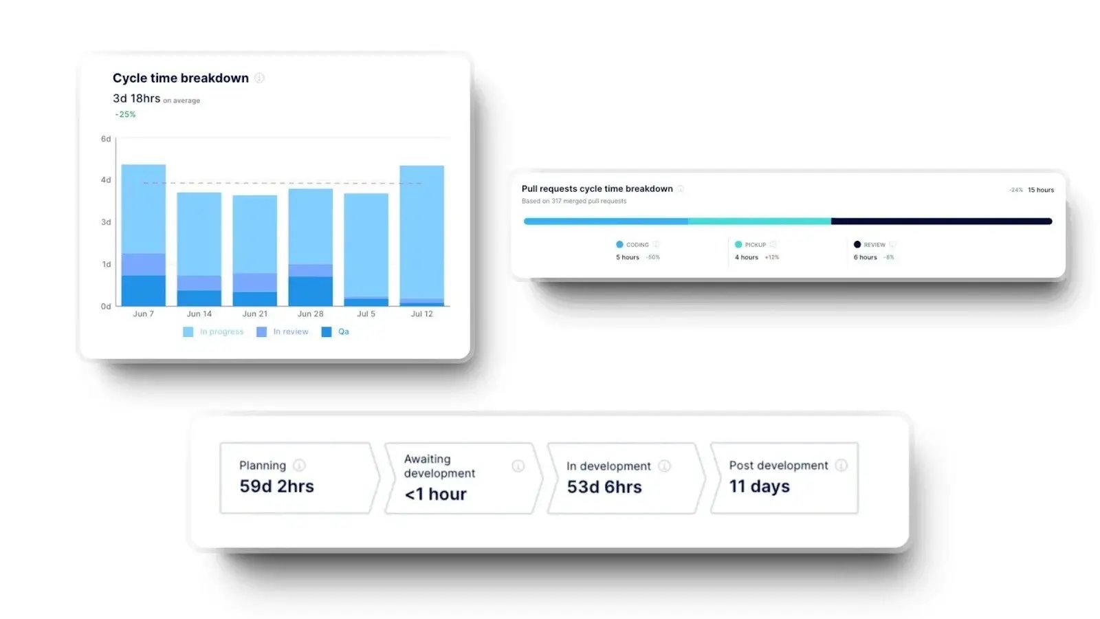
1. Issue Lead Time/Cycle Time
Lead time in Agile denotes how long an issue takes (including waiting time), i.e., the time from when it's requested to when it's delivered. Cycle time is the elapsed time (not process time) for a cycle, such as the time between starting and completing a work item or the elapsed time a work item spends as a work in progress.
Calculating lead and cycle time allows you to track each task's length and use that information to improve your project completion estimates. Elite teams report cycle times of three days, while good teams’ cycle times can get to 7 days. Of course, this depends on the project’s complexity.
You can track lead and cycle time metrics with a sprint, Jira board, or a custom tool such as Axify. In the dashboard, you can visualize when the work starts on an issue and when it's ready for deployment. In Axify, we measure cycle time on three levels: deliverables (e.g., epics), issues, and pull requests. Here's what that looks in practice:
2. Throughput
Throughput indicates the number of work items completed over a period of time. It's considered one of the most important Agile performance metrics, and for a good reason.
This metric reveals your team's capabilities. That allows you to plan more effectively how much work you can complete in that timeframe.
When you track both throughput and cycle time, you can increase the project's predictability. For example, Axify's Service Level Expectation graph (Cycle Time Scatterplot) displays completed tasks during a period (in days).

Our expert opinion: Instead of aiming for higher output, average teams should prioritize a stable and predictable throughput. While these numbers are highly dependent on the team and the nature of the work, a good range for a small team is typically 10–25 completed work items per week, or 3–7 items per team member per sprint, provided the cycle time remains consistent.
3. Work In Progress (WIP)
Work in progress denotes the number of work items currently “in progress” in your workflow. It's an important Agile metric to follow because it shows you all the unfinished work.
Agile teams want to reduce their work in progress because doing so increases their throughput and reduces cycle time. It will also reduce the bad effect of context switching.
As such, you'll be able to concentrate on the most critical tasks and increase the speed of value delivery to the users.
This view shows how our team at Axify measured work in progress over time by tracking average, minimum, and maximum active issues each week. The next step was reducing concurrent work to stabilize flow and shorten cycle time by focusing on finishing items before starting new ones.

Our expert opinion: Average teams should keep work in progress close to the number of active team members, usually team size ±1. When WIP grows beyond that range, cycle time and predictability tend to degrade due to context switching and hidden queues rather than real capacity limits.
4. Work Item Age
The time elapsed between a work item's start date and current status is the work item age or aging work in progress. This Agile metric applies only to unfinished work items as a leading signal. It's a valuable metric besides cycle time because it's suitable for completed work items.
Typically, we would compare work item age with the Service Level Expectation graph, precisely the 70th and 85th percentiles. We do this to draw attention to old items and “swarm,” i.e., stop what we're doing and concentrate on completing those tasks that take longer.
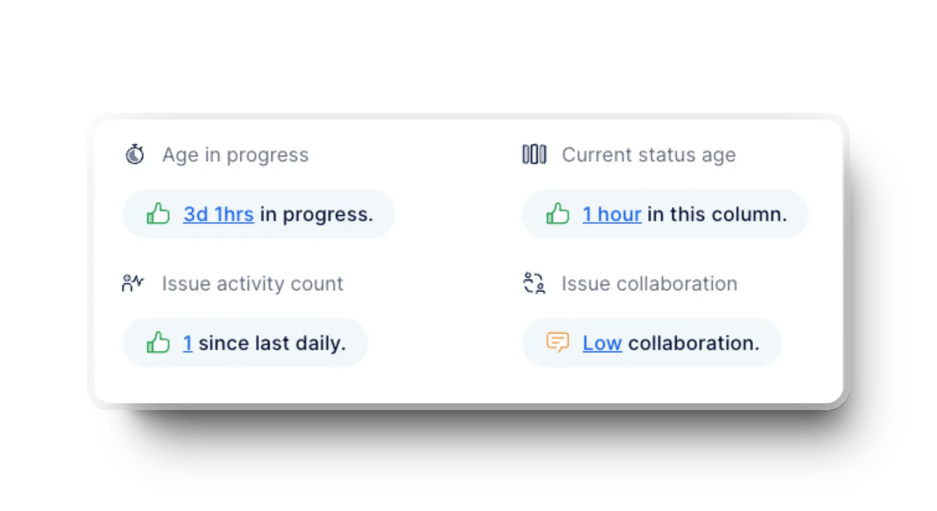
Our expert opinion: Average teams should treat any work item whose age exceeds the 85th percentile of historical cycle time as at risk. Items crossing that threshold usually indicate hidden blockers or oversized scope and should trigger swarming or immediate scope adjustment before predictability breaks down.
5. Flow Efficiency
Flow efficiency is another crucial Agile project indicator. It displays your developer productivity from beginning to end. To determine the flow efficiency, you divide the time spent actively working by the total elapsed time, including any phases during which no work is being done.
Industry benchmarks suggest that 15-40% flow efficiency is healthy for most teams, while anything above that is considered exceptional. And it usually signals minimal waiting time and well-managed flow.
To frequently check your process efficiency, you can use a flow efficiency chart that displays active and queuing times. This makes it easier to identify problems early on and find quick solutions.

6. Time Investment Summary
The time investment summary provides a detailed breakdown of how you allocate effort across various tasks in your Agile projects. It reveals the percentage of total invested time for each issue type and its average completion time.
This metric does this by offering valuable insights into time management and efficiency. So when you understand these allocations, your team can identify opportunities for process improvements. That way, you can spend time on activities that drive project success and align with your goals.

Our expert opinion: Average teams should see the majority of time investment concentrated in planned development work rather than rework or bugs. When bug or unplanned work consistently consumes more than 20-30% of total time, it usually signals upstream quality or prioritization issues that deserve immediate attention.
Predictability sets the foundation for reliable delivery and confident planning. These metrics show how well commitments translate into outcomes over time.
7. Commitment Reliability
Commitment reliability measures how frequently planned work actually gets completed within the agreed timeframe. This metric matters because weak reliability breaks trust with stakeholders and forces constant replanning.
Strong reliability usually appears when sprint goal consistency is clear, and work intake stays controlled rather than ad-hoc additions.
Our expert opinion: Average teams should aim for 75-85% commitment reliability. This is because levels below that usually signal overloaded scopes or unstable planning practices under Agile methodologies.
8. Planned-to-Done Ratio
Planned-to-done ratio compares what was entered in a sprint or cycle against what was finished. This metric exposes whether your plans are realistic or inflated by optimism and manual tracking habits.
From our experience, healthy ratios tend to appear when team members limit work in progress and align planning with historical throughput instead of estimates.
Our expert opinion: Average teams typically operate between 70-90%. Lower ranges suggest overplanning, and higher ranges may hide unplanned work entering mid-cycle.
Quality metrics reflect how safely changes move through the system. Stability shows whether speed creates downstream risk or sustainable progress. So, these indicators focus on delivery outcomes, system resilience, and customer impact.
9. Escaped Defects
Escaped defects track issues discovered after release rather than during development. Tracking this metric helps you avoid late defects that increase rework and erode customer trust. Stable systems rely on early feedback loops and disciplined review practices.
Our expert opinion: Escaped defects should stay as close to 0% as possible, with any increase treated as a signal to inspect review depth or testing gaps.
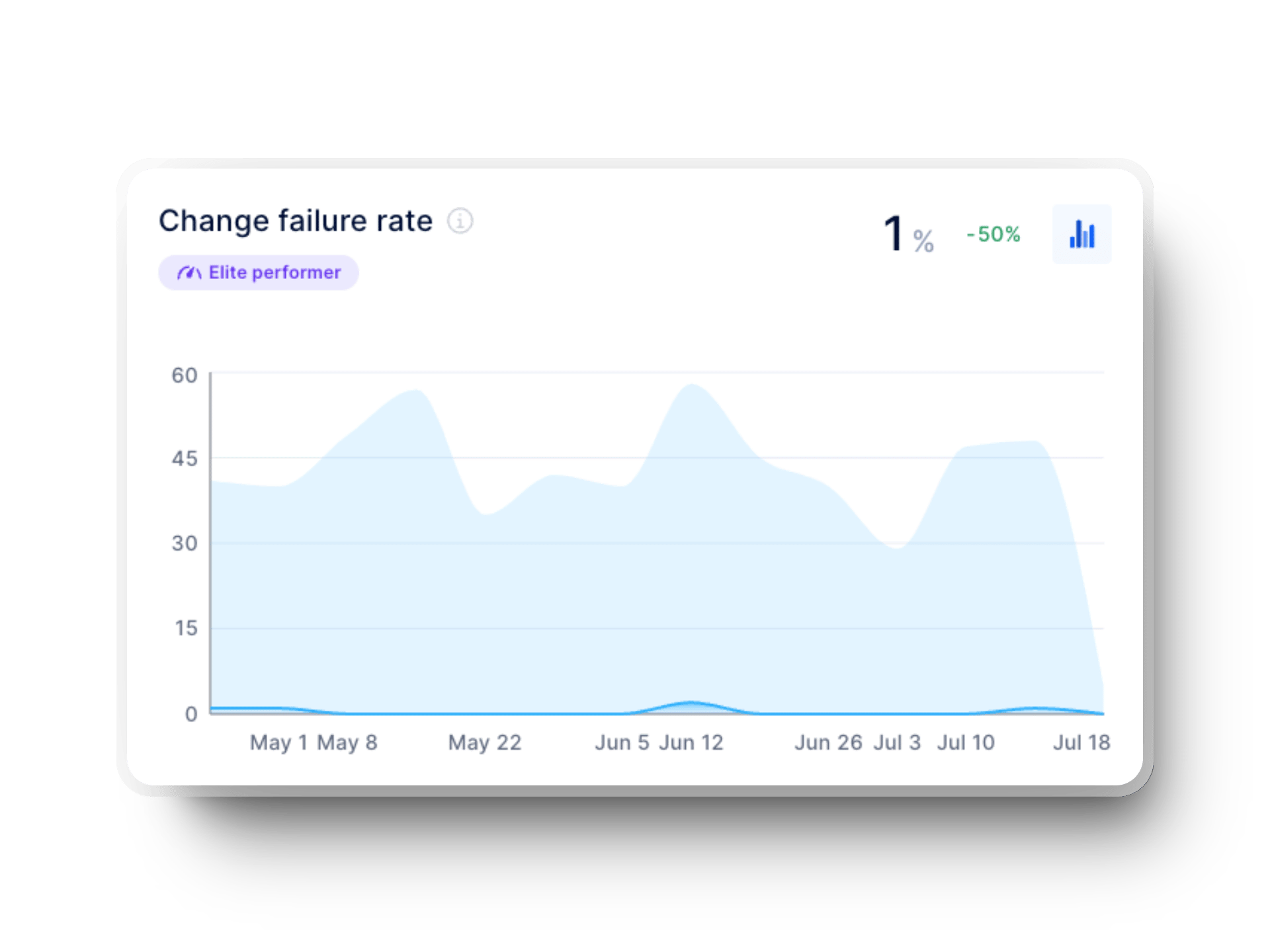
10. Change Failure Rate
Change failure rate measures how frequently deployments require fixes or rollbacks. High rates indicate fragile delivery pipelines and poor risk control.
According to the 2025 DORA Report, 8.5% of teams operate in the 0-2% range. This shows that stability and speed can coexist when flow is managed intentionally.
You can use Axify to track the change failure rate over time by linking failed deployments to total deployments for each period. This makes it easier to spot risk spikes early and tighten release practices before instability becomes a pattern.
11. PR Review Time
PR review time captures how long code waits before feedback or approval. Long delays usually point to unclear ownership or overloaded reviewers rather than complex code. Shorter cycles improve flow and reduce context switching for team members.
Our expert opinion: Average teams should target a 12-48 hours PR review time. Anything beyond that typically slows delivery more than development itself.
12. Customer Satisfaction
Customer satisfaction reflects whether delivery quality meets real user expectations. In other words, this metric connects engineering output to actual outcomes rather than internal activity. Strong results appear when team feedback loops include production signals instead of just subjective or anecdotal input.
In practice, teams usually track customer satisfaction through structured signals such as CSAT surveys, NPS, or in-product feedback. However, we recommend you to review these as trends rather than point-in-time scores.
Our expert opinion: Average teams should sustain more than 80% satisfaction, with drops treated as early warnings rather than support-only issues.
13. Code Churn
Code churn tracks how much code gets rewritten shortly after completion. Excessive churn suggests unclear requirements or rushed merges. On the other hand, low churn usually aligns with stable flow and clearer value stream management visibility.
Our expert opinion: Average teams should stay below 20-30% churn per cycle. We typically see higher levels correlate with planning or discovery gaps.
14. AI Improvement Metrics
AI improvement metrics compare delivery performance with and without AI assistance. Tracking these metrics matters because perceived gains from AI may differ from real outcomes.
Axify’s Performance Comparison feature has real-time analytics that show how AI adoption affects cycle time, failure rates, and delivery stability, so you get measurable team insights.
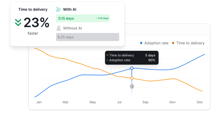
Sign up here to see how Axify’s Performance Comparison feature highlights the impact of AI adoption across delivery speed, stability, and reliability.
Delivery metrics explain how fast value reaches production without masking volatility. Velocity becomes meaningful only in stable, predictable environments. So, the metrics below connect throughput to sustainable execution.
15. Deployment Frequency
Deployment frequency tracks how often code reaches production. Frequent deployments reduce batch size and risk while accelerating feedback.
The 2025 DORA report notes that 16.2% of teams deploy on demand, while another 6.5% deploy between once per hour and once per day. This means multiple deploys per day without added instability.
You can track deployment frequency in this Axify view, which shows how it changes over time, with each release counted automatically from your delivery tools.

This makes it easier to see whether the release cadence is increasing steadily or fluctuating due to batching or process friction.
16. Release Frequency
Release frequency measures how frequently a value becomes available to users. As a side note, release differs from deployment because it reflects customer-facing outcomes. Consistent releases usually rely on disciplined flow control rather than aggressive targets.
Our expert opinion: Weekly to biweekly releases work well for many teams, though highly complex or regulated systems may require longer cycles. Slower cadences usually hide integration risk while faster ones require mature automation and alignment.
An Agile metrics dashboard is useful when it turns delivery data into clear, shared signals that teams can act on. These are the key reasons teams rely on dashboards to support better decisions and continuous improvement.
Agile metrics dashboards can help you display your messy data in easy-to-understand analytics. This dashboard should provide a simple and clear overview of each team's software delivery performance. Also, it should present data to users without being too overwhelming.
For software development teams and project managers, an Agile metrics dashboard works similarly to a visual control centre. It dives deeply into your software development processes, and it provides an actionable view of important Agile metrics. This includes work progress, high-priority issues, and possible bottlenecks in real time.
In short, an Agile metrics dashboard should be:
An Agile metrics dashboard brings clarity to delivery by turning raw data into a shared understanding. When done right, it helps teams see progress, risks, and tradeoffs without adding reporting overhead.
Here are the core steps that help shape a dashboard that teams actually trust and use.
1. Identify your goals & framework (Scrum vs Kanban vs Hybrid).
We advise all our clients to start with the intent rather than the tools. Goals define what matters, and the framework shapes how work is organized and measured.
Teams with clear goals tend to act more deliberately. In fact, employees with clearly defined goals are 8.1 times more likely to look for ways to improve their work. So clarity here sets the tone for everything that follows.
2. Pick metrics that align with delivery, predictability, and stability.
Once goals are clear, metrics should map directly to them. Flow and time metrics help understand delivery speed, predictability metrics support planning confidence, and quality metrics protect stability. So, we believe that a small, focused initial set of metrics makes trends easier to read and discuss.
3. Set up automations & integrations.
Manual data collection creates friction and delays insight. But automation removes that burden and keeps metrics current without extra effort.
And you won't be the first one doing this. Nearly 60% of companies have implemented technology to automate tasks previously done manually. This reflects a broader shift toward reducing reporting work and increasing decision time.
That’s why many teams compare automation approaches before committing to a specific tooling stack. Here are 15 best SEI platforms you can evaluate before making a decision.
4. Visualize your flow (dashboard layout best practices).
Visualization should make problems obvious. Charts that show trends, distributions, and flow states help teams spot bottlenecks, aging work, or volatility at a glance. Besides, we noticed that clear layouts support faster conversations during reviews and planning.
5. Create rituals around reviewing metrics (standups, retros, sprint reviews).
We believe that metrics only matter when they’re discussed regularly. So, reviewing them during standups, retrospectives, or sprint reviews builds shared context. Over time, these rituals turn metrics into signals for action rather than passive reference points you see in static reports.
Axify is a single platform that allows you to observe all the key performance indicators that will help you improve your development and delivery processes. It provides superior dashboards and real-time tracking of Agile metrics. This makes the whole process simpler and enables teams to focus on improvement.
Here's how you can do that easily:
Feel free to contact us for a free demo on creating your Agile metrics dashboard.

Agile metrics work best when they guide decisions and encourage improvement. And the way metrics are tracked and discussed usually matters more than the metrics themselves.
These practices reflect what consistently helps teams get real value from Agile data:
Agile metrics can bring clarity, but they can just as easily create confusion when used the wrong way. Many teams track the right numbers yet still struggle because of how those metrics are interpreted and applied.
These are the most common mistakes that tend to limit the real value of Agile metrics.
One of the mistakes we frequently see is velocity becoming a target rather than a signal. When that happens, work gets rushed through just to keep numbers high, while real outcomes stay unchanged. Over time, this focus pulls attention away from customer impact and delivery quality.
Metrics lose meaning when only a few people can see them. When dashboards stay hidden, teams miss the chance to spot issues early or suggest improvements. We advise our clients to implement shared visibility because that supports better conversations and stronger ownership.
Switching between story points, hours, or other estimation techniques makes trends unreliable. Without consistent measurements, comparisons across sprints or projects stop making sense, and planning becomes reactive.
We've noticed that starting more work can “feel” productive, but it usually just slows everything down. When WIP limits are ignored, context switching increases and cycle time stretches. Flow improves when finishing aging work becomes a priority.
Single-sprint snapshots rarely tell the full story. Without enough historical data, teams react to noise rather than leverage patterns. Trends across weeks or months provide far better guidance for improvement.
Metrics were never meant to judge individuals. Once numbers are tied to performance reviews, behavior shifts toward self-protection instead of learning. The healthiest teams use metrics to ask better questions rather than to assign blame.
Agile metrics become most valuable when they support learning, clarity, and steady improvement rather than reporting for its own sake. And when flow, predictability, quality, and delivery are tracked together, teams gain a clearer picture of how work actually moves and where change matters most. From there, better conversations follow.
So if a clearer, shared view of delivery is the goal, contact Axify today and start building metrics that teams trust and use.