Agile
17 minutes reading time


You’re responsible for leading a development team that needs to deliver fast, adapt quickly, and improve constantly. But unless you’re using the correct data, you’re making decisions with one hand tied behind your back.
Agile metrics to track dev teams' performance provide you with the clarity to act, the numbers to back it up, and the visibility to know whether things are improving.
In this article, I'll give you a detailed look at the 15 Agile metrics that matter most in 2025. I'll tell you which ones drive team productivity, which highlight risk early, and which help you plan future work with confidence. You’ll see how each metric fits into a bigger picture that covers delivery speed, planning accuracy, technical health, and team morale.
By the end, you’ll know exactly how to build a performance tracking system that works for your team, not someone else’s. And I’ll walk you through how Axify makes that process a whole lot easier by connecting the dots between the numbers and your team’s reality.
Let’s break down the metrics that move the needle.
|
Metric Name |
What it Measures |
Why it Matters |
Target Values/ Benchmarks |
Implementation Complexity |
|
Cycle Time |
Time from start to finish of a task |
Highlights delays and helps optimize workflow |
3 days |
Low: Tracked automatically in most tools; easy to visualize and discuss during retros or standups. |
|
Lead Time |
Time from request to delivery |
Shows total value delivery time |
Steady or improving |
Medium: Involves tracking from initial request to delivery, which spans multiple systems or stages. |
|
Throughput |
Completed tasks in a given time period |
Helps forecast delivery and track team output |
Steady or increasing trend weekly |
Low: Simple count of completed tasks; already surfaced in most dashboards. |
|
Velocity |
How much work a team can accomplish in a sprint |
Supports sprint planning and trend tracking |
Stable average over several sprints |
Low: Built into any sprint-based tool; requires little setup or explanation. |
|
Service Level Expectation (SLE) |
Likelihood of delivering work within a set time |
Builds trust with predictable delivery times |
Stable or improving |
Medium: Needs percentile tracking over time and clear work item definitions; not always intuitive at first. |
|
Sprint Burndown |
Remaining work in a sprint |
Tracks sprint progress daily |
Consistent downward trend |
Low: Automatically visualized in sprint tools; teams are familiar with it. |
|
Release Burndown |
Progress against a release plan |
Keeps releases on track and stakeholders informed |
Progress matches the timeline |
Medium: Requires linking tasks to releases or milestones; slightly more setup. |
|
Estimation Accuracy |
Accuracy of effort estimates |
Improves planning accuracy |
Consistently improving accuracy |
Medium: Depends on consistent effort estimation practices (e.g., story points) and historical tracking. |
|
Defect Density |
Defects per 1,000 lines of code |
Reflects software quality and maintainability |
<1 defect per 1,000 lines |
High: Needs code analysis tools and normalization per line of code; harder to implement cleanly. |
|
Code Coverage |
Percentage of code covered by tests |
Indicates testing depth and reliability |
Above 80% |
Medium: Test tools provide the data, but teams need to interpret and act on it correctly. |
|
Technical Debt |
Time or effort spent fixing issues caused by technical shortcuts |
Highlights the long-term impact of quick fixes |
Keep low and improving |
High: Can require manual tagging, rework tracking, or subjective judgment across teams. |
|
Team Morale |
Team’s emotional and motivational state |
Influences productivity and engagement |
Improves post-team-building efforts |
Medium: Needs regular survey or feedback loops; easy to collect, but still a process to run. |
|
Team Stability |
Team member turnover rate |
Affects team continuity and onboarding costs |
Stable or improving |
High: Relies on HR or management data; not typically tracked in delivery tools. |
|
Deployment Frequency |
Frequency of code deployments |
Measures the speed of delivery |
Multiple times per day |
Medium: Requires CI/CD observability; easy if integrated, trickier if not. |
|
Lead Time for Changes |
Time to implement a code change |
Tracks the responsiveness of the development team |
Less than 24 hours |
Medium: Needs pipeline data from commit to deploy; requires integration. |
|
Failed Deployment Recovery Time |
Time to restore service after failure |
Indicates recovery strength after issues |
Under one hour |
High: Not automatically tracked; needs monitoring and recovery metrics set up. |
|
Change Failure Rate |
Failures after deployments |
Measures the reliability of deployments |
0% to 5% |
Medium: Requires defining what counts as a failure and tagging or tracking incidents consistently. |
You need clear, focused metrics to gain a real picture of how your team works and where to make improvements. Here are the key performance indicators for Agile teams that help you track progress, plan better, and strengthen your development process across delivery, quality, and team health.
If you’re trying to improve how your team delivers work, these are the first metrics you should track. They show how quickly and consistently your team ships value. Here are the delivery-focused Agile team performance metrics that help you get real results.
Cycle time tells you how long it takes to finish a piece of work once someone starts it. If you pick up a task on Monday and complete it Friday, that’s five days of cycle time. This metric captures effort, but it also reflects delays, distractions, and process breakdowns. When your cycle time increases, it's usually a sign that something is off.

To measure it, you can track the time between when a task enters “in progress” and when it moves to “done.” Most tools, such as Jira or Azure DevOps, already track these timestamps, so it’s just a matter of creating a report or letting Axify handle it automatically with real-time visual tracking.
Example: Let’s say a feature starts on April 1 and is finished on April 4. That’s a cycle time of 3 days.

If you’re wondering what good looks like, high-performing teams typically wrap up work in under two days. According to experts, good teams clock in at 3 days on average.
If your team’s anywhere near that range, you’re on the right track. If not, you’ve just found a great place to focus.

While cycle time measures the moment work begins, lead time starts the moment it’s requested. It tracks the whole journey, from when a task is added to the backlog to when it’s shipped. This provides a broader view of how long it takes to deliver value from both user and business perspectives.
To measure it, you can use timestamps from the task’s creation to its final delivery. Teams using Axify can skip manual tracking since lead time is automatically pulled and displayed clearly alongside other delivery metrics.

Example: If a task was created on April 1 and deployed on April 8, the lead time is 7 days.
Keeping your lead time short shows your team isn’t only fast but also responsive. That’s why this metric ties so closely to customer satisfaction and planning accuracy in Agile development.
Throughput tracks how many tasks your team completes in a specific time frame. It could be weekly, per sprint, or monthly. This number indicates whether your delivery engine is speeding up or slowing down.
To measure it, you can count the number of completed items over the chosen time frame. Unlike story points, throughput measures actual work delivered.

A quick way to start is by checking how many items are marked as “done” each week. Or let Axify do the heavy lifting by automatically tracking and visualizing your throughput.
Example: If your team finished 25 tasks over 5 working days, your throughput is 5 tasks per day.

A high throughput doesn’t mean you’re rushing. It means your team is working efficiently and staying focused. Top-performing teams typically ship multiple updates per day with change lead times under 24 hours. That’s what excellent throughput looks like (fast, reliable, and controlled).
When your throughput is steady, it becomes one of the most effective metrics for a development team to track. It helps you make better delivery forecasts and sets realistic expectations during sprint planning.
Velocity shows how much work your team completes in a sprint. Many teams measure this variable in story points. It’s one of the most familiar Scrum metrics and for good reason. It helps you plan future sprints with confidence.
To calculate it, you just need to total the story points from completed tasks in a sprint. Do this over several sprints to get your average. This average tells you what your team can likely finish next time, assuming no major surprises.

Example: If your team completes 22, 25, and 21 story points across three sprints, your average velocity is (22 + 25 + 21) ÷ 3 = 22.7 story points per sprint.
Side note: I believe that velocity is for internal use. You should never compare it across teams because each team assigns points differently. That’s why velocity is great for seeing trends, not for competition.
If you see your velocity rising steadily, your team may be improving its focus or smoothing out blockers. If it drops, you may need to examine your workload, team health, or consider process changes. If you're using it properly, velocity can help you spot patterns and plan smarter for future sprints.
As a general reference point, newly formed Scrum teams typically average around 5 to 10 story points per person in a two-week sprint, which can help set initial expectations as the team builds its rhythm.
Cycle time, lead time, throughput, and velocity each tell part of the story. Together, they help you see what’s slowing you down, how fast you’re moving, and what’s realistic for the future.
You can use them side by side, and you’ll have a clear, balanced picture of your delivery process. One that helps you make informed decisions and build stronger, more responsive teams.
To build trust, stay on schedule, and deliver work without last-minute chaos, you need to measure predictability. These metrics help you plan more effectively and track how closely your team adheres to those plans. Here are the ones that matter most.
Service Level Expectation (SLE) helps you set accurate delivery expectations. It indicates the likelihood of completing work within a specified number of days, based on your historical cycle time. So instead of guessing, you're using real data to say, “We can likely deliver this in X days.”
To calculate it, you should look at a set of completed tasks and identify the cycle time at your target percentile. For example, if you pick the 85th percentile, this means 85% of work items were completed in that number of days or fewer.
Axify does this for you automatically by providing a percentile-based view of delivery timelines, allowing you to speak in probabilities, not assumptions.

Example: Let’s say your last 100 tasks show that 85 of them were completed in 6 days or less. That means your ELS is 6 days at the 85th percentile. You can now say with confidence: “We’ll likely deliver new tasks within 6 days, 85% of the time.”
That level of predictability builds trust with stakeholders and helps you avoid overpromising. It also reveals where delays typically occur and is one of the most valuable metrics for the dev team to track.
The sprint burndown chart shows how much work remains in a sprint and how fast you’re completing it. It helps you check daily if your sprint is on track or if something's off. You’ll spot blockers early instead of being blindsided later.
The chart plots remaining effort (usually story points or tasks) against the sprint timeline. You want to see a steady downward slope.
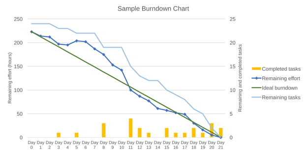
If the line stays flat for several days, it usually means tasks aren’t progressing. If the line suddenly drops, your team may be rushing to close tasks or updating everything at once near the end. Both are signs you’ll want to dig into during your sprint reviews.
You can use Agile tools like Axify or Jira to track sprint progress automatically. Axify gives you a simple, real-time view of your work in progress and throughput, so there's no need to update anything manually. This keeps everyone on the same page and helps teams make better decisions during daily stand-ups.
Release burndown works similarly to sprint burndown, but for a larger body of work spanning multiple sprints. It helps you determine if you're on track to meet a release date or if you need to adjust your scope or priorities.
You track remaining story points or tasks against the overall release timeline. This gives you a rolling view of how close you are to completing everything promised in the release. It’s useful for product owners and stakeholders who need visibility beyond a single sprint cycle.

This is where Axify’s forecasting really stands out. It utilizes historical throughput and Monte Carlo simulations to project delivery timelines and identify potential risks. This gives teams a clearer view of what's realistic and helps manage expectations early on.
Estimation accuracy measures how close your initial effort estimates are to the actual effort required. It shows how well your team understands the work before they start and helps you identify patterns in under- or overestimation.

Example: If you estimated a story at 10 points and it took 13, your estimation accuracy is: (10 – 13) ÷ 10 × 100 = -30%. That’s a 30% overrun.
To track this, you can compare the estimated story points with the points actually completed for each sprint or feature. If you consistently complete what you plan, you’ve got solid estimation habits. If you're way off, it may be time to revisit how you size work or conduct sprint planning.
Most developers are aware that software projects typically overrun effort estimates by approximately 30%. That’s not a small gap, but a sign that most teams consistently underestimate. Additionally, Capers Jones noted that estimation accuracy within ±10% is achievable, but only under tightly controlled project conditions —a condition that most teams rarely maintain consistently.
Each of these metrics supports the others. SLE tells you how predictable you are. Sprint and release burndown charts help you track your day-to-day and long-term progress. Estimation accuracy shows how realistic your plans are in the first place.
Together, they help you spot risks early, communicate clearly, and build a planning system that works for your team and your product goals. If you're serious about improving delivery consistency, these are the Agile KPIs to start with.
To build software that lasts, you can’t just move fast. You also need to track how well your code holds up. These metrics give you a clear view of quality, stability, and the hidden issues that quietly slow you down. Here are the ones that matter most.
Change failure rate tells you how frequently your deployments “break” something in deployment. This metric shows the percentage of changes that cause incidents, outages, or require a rollback.

Example: If 2 out of 20 deployments lead to incidents, your failure rate is 10%.
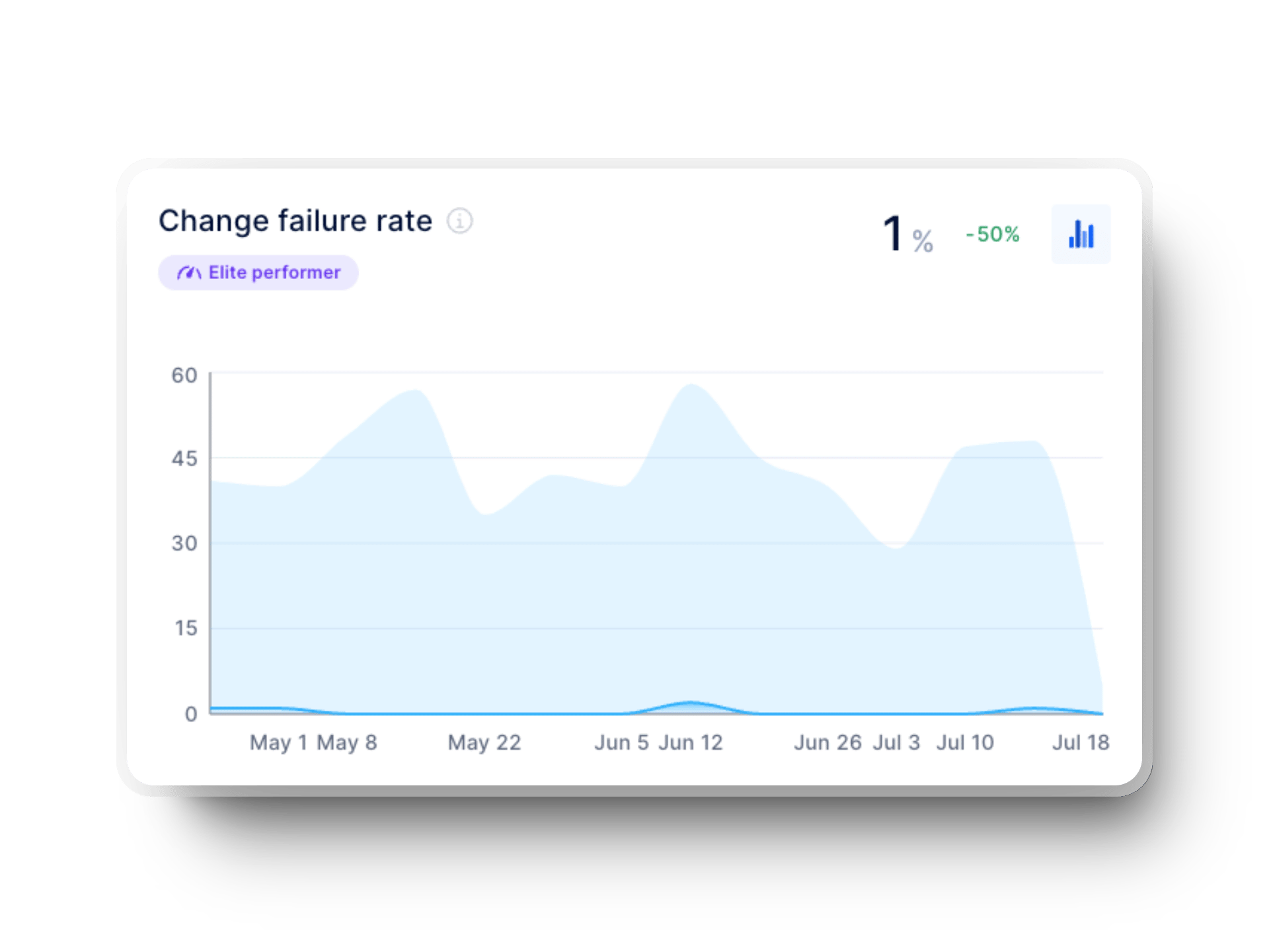
That number matters more than you think. If you’re constantly making and fixing changes, your team loses momentum and confidence. You become more hesitant to ship, and trust from stakeholders starts to wear thin.
To lower this rate, you should focus on smaller, more frequent deployments, thorough code review processes, and stronger automated testing. Also, don’t wait to test everything at the end! Shift that feedback earlier in your development process.
Elite teams maintain low failure rates. According to DORA’s 2024 DevOps report, Elite performers stay between 0% and 5%. More interestingly, medium-performing teams have a higher change failure rate (10%) than high-performing teams (20%).
A good explanation for this is that high-performing teams adopt faster, more frequent deployments, which increases risk. Medium performers tend to deploy less often, so they have more time to test and verify changes, and that results in fewer failures.
Defect density measures how many bugs slip into your codebase. It's one of the most apparent signs of your software quality. Lower is always better, but only if your detection systems are solid. If you're testing thoroughly, running code reviews, and monitoring in production, then a low defect rate is a true sign of engineering quality.

Example: If your team finds 5 bugs in 10,000 lines of code, your defect density is 0.5 per KLOC (1,000 lines of code).
That’s strong. Some sources note that the industry average ranges from 5 to 10 defects per KLOC, while the best teams maintain a rate of less than 1. Keeping your numbers down here means less rework, fewer surprises, and happier users.
For more context, other studies report defect densities ranging anywhere from 10 to 50 per KLOC, depending on system complexity. Internal Microsoft data shows 10–20 defects per KLOC during development, with that number dropping to just 0.5 per KLOC once the software is released.
A sudden spike could mean you're shipping too fast, skipping reviews, or dealing with complex features. And if you’re using Axify, you won’t see defect density itself. Still, you will see indicators of delivery quality, like DORA metrics, which help you spot when things might be trending in the wrong direction. Essentially, this data becomes part of your broader view of technical health.
Code coverage shows you how much of your codebase gets tested. It doesn’t tell you if your tests are good, but it does show if your team is leaving significant areas untested.

Example: If you run tests that hit 800 out of 1,000 lines of code, your coverage is 80%.
You should aim for meaningful coverage, not just high numbers. Chasing 100% typically leads to fragile or useless tests. Instead, make sure your tests cover core functionality, business logic, and critical paths.
Research examining 47 projects across seven programming languages found that the average code coverage ranged between 74% and 76%. According to Google's internal ratings, 60% was considered acceptable, 75% solid, and 90% excellent.
Technical debt metrics tell you how much “quick and dirty” code is slowing you down. You feel it when features take longer than expected or bugs reappear in the same spot. Some sources view technical debt through the lens of costs incurred; others define it as “the difference between what was promised and what was actually delivered.”
In both cases, we can see the meaning of the word “debt” takes on a very real form: something you’re paying interest on, sprint after sprint. That 'interest' might be longer QA cycles, unstable releases, or devs spending hours untangling brittle logic instead of building new value. And like financial debt, the longer you ignore it, the more expensive it becomes.
That said, technical debt can be planned or happen by accident.
For this article, let’s consider the following technical debt formula because it better reflects how engineering trade-offs impact business outcomes:

Example: If fixing bad code costs $20,000 and your total build cost was $100,000, you’re carrying 20% in technical debt.
According to McKinsey, the average technical debt ranges from 20% to 40%, although it is recommended to keep it below 5%.
Use this data to drive internal conversations. You can’t pay it all off at once, but you can make smarter tradeoffs. While Axify doesn’t measure technical debt directly, it gives you visibility into delivery trends so you know where to invest next.
A 2018 study found that while only 7.2% of organizations actively track technical debt, those that do (and take steps to reduce it) deliver services at least 50% faster and experience noticeable performance improvements.
The change failure rate, defect density, code coverage, and technical debt each convey different information. Still, they all feed into one thing, which is your team’s ability to ship quality code without slowdown. Together, they support continuous improvement and make your quality measurable.
As part of your Agile KPIs, these metrics help you balance delivery speed with software quality. And when you connect them with process efficiency and team dynamics, you get a complete picture of your engineering health.
You can’t deliver great products without a healthy team. If burnout is rising or people are constantly switching teams, it becomes apparent quickly in your delivery metrics. Here are the two key metrics to keep an eye on.
Team morale reflects how your developers feel about their work, their environment, and each other. When morale is low, productivity drops, and quality issues rise. When it’s high, people go the extra mile, collaborate better, and stick around longer.
To measure this, send out short, anonymous pulse surveys regularly. Ask about stress levels, clarity of goals, and overall job satisfaction. Maintain consistency in the scale so you can track trends over time. Axify makes this easy by collecting this data continuously and connecting it to your delivery metrics.
![]()
The impact is real. Studies show that 63% of leaders report better communication and 61% see improved morale after team-building efforts. When you focus on morale, you're building a stronger delivery engine.
Team stability measures how consistent your team composition remains over time. Frequent turnover can tank your momentum. New members require time to onboard, and valuable knowledge often leaves with those who exit.
To monitor this, track how frequently team members change roles, switch teams, or leave the company. Axify automatically highlights trends in velocity and sprint progress that you can correlate with changes in team stability and morale.
The stakes are high. A 2021 report from the Bureau of Labor Statistics showed the software developer turnover rate was 57.3%. That’s a massive hit to continuity and process efficiency. You can’t afford to ignore it.
Morale and stability feed off each other. When people feel good and stick around, collaboration gets easier. Your Agile processes run smoother, and your team is better equipped to hit sprint goals without burning out.
When you're trying to deliver reliable software fast, DORA metrics help you focus on what matters. They give you a clear picture of how frequently you ship, how stable your changes are, and how quickly you bounce back from problems.
The Agile metrics above help you plan sprints, measure productivity, and track quality, but they don’t always show how well you deliver at scale. That’s where DORA metrics step in. These four engineering metrics let you measure speed, stability, and delivery health in production.
DORA metrics pair well with metrics such as cycle time, velocity, and code quality to give you both internal and external performance signals. While Agile metrics typically focus on team behavior and process, DORA metrics zoom out to assess the real-world outcomes of those efforts: meaning how quickly and reliably software is delivered to users. This combination helps you strike the balance between moving fast and delivering reliably.
Here are the DORA metrics that you need to follow.

Deployment frequency measures how frequently your team successfully pushes code to production. This means speed, and it reflects confidence in your CI/CD pipeline. Frequent deployments mean smaller, safer changes.
They reduce risk and allow faster feedback. With Axify, you get a running view of deployment cadence across time, which helps you spot delivery slowdowns before they snowball into missed deadlines. It’s one of the clearest indicators of continuous delivery in real Agile environments.
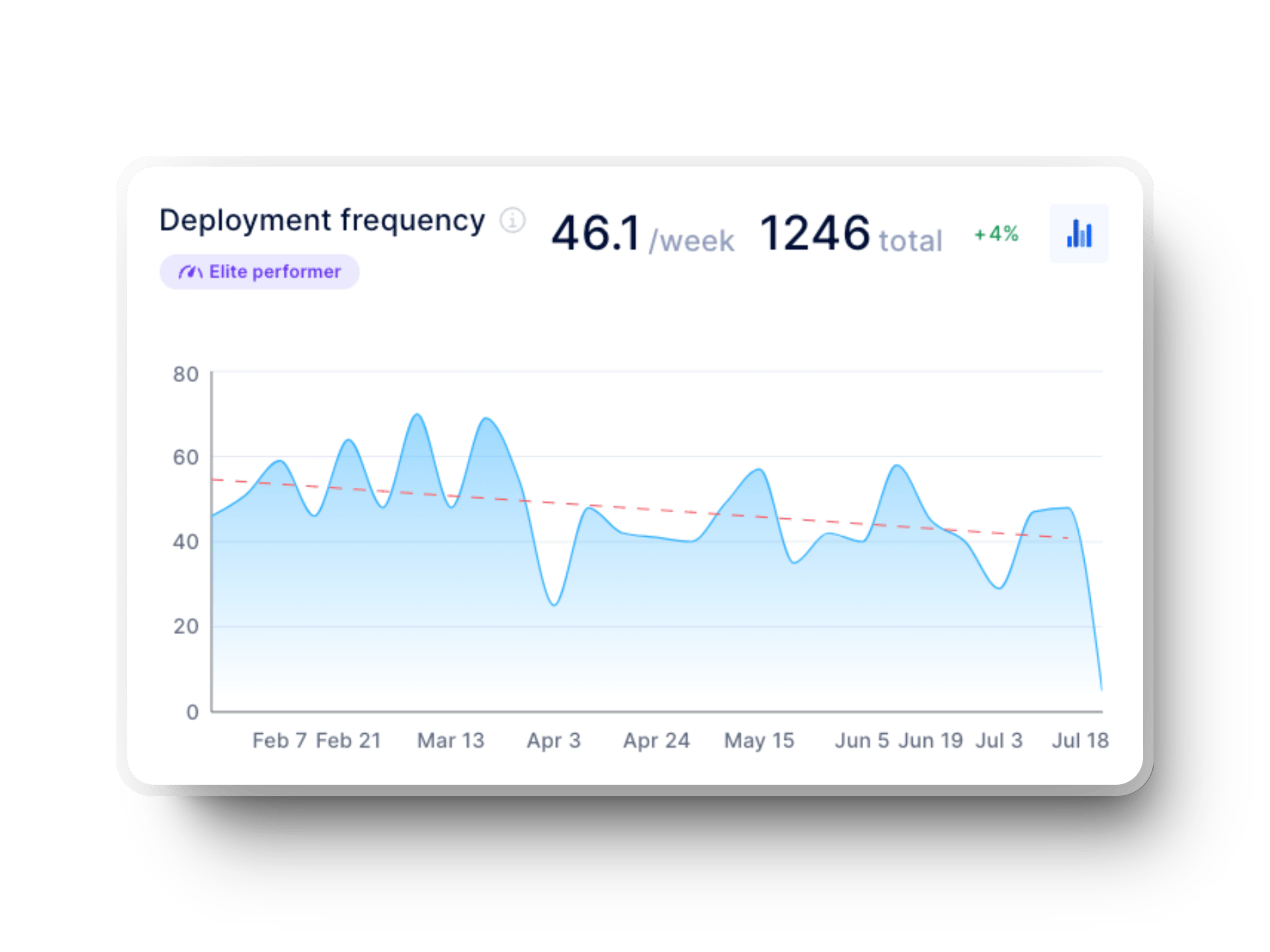
According to the 2024 Accelerate State of DevOps report, elite teams deploy on demand, often multiple times per day, while low performers only release code between once a month and once every six months.
Lead time for changes captures the time between when a change is committed and when it’s live in production. Shorter lead time for changes means faster value delivery and quicker iterations. If they’re long, you’re likely hitting delays in code review, testing processes, or deployment approval.
Axify automatically maps this metric, enabling you to identify bottlenecks and unlock cycle time improvements quickly. This is key for improving both team efficiency and customer satisfaction.

According to the 2024 DORA Report, Elite teams typically push changes live in less than a day, while teams that struggle may take anywhere from a month to six months. Improving this metric leads to more efficient workflows and happier users.
MTTR shows how fast you recover when something breaks. Tracking this matters because no team is immune to failure; however, a fast recovery builds resilience. High MTTR slows down momentum and eats into team confidence.
With Axify, you can identify patterns in incidents and tighten your recovery loops. A fast MTTR reflects not just technical ability, but also strong team dynamics and adequate preparation.
%20in%20axify%20for%20software%20development%20teams.webp?width=1920&height=1440&name=time%20to%20restore%20service%20(dora%20metrics)%20in%20axify%20for%20software%20development%20teams.webp)
The 2024 Accelerate State of DevOps Report outlines four levels of performance here:
Improving this metric isn’t just about fixing code fast; it’s about teamwork, readiness, and having the right systems in place.
We've already covered what Change Failure Rate is, but keep in mind that you need to keep this low to maintain trust and speed. According to the Accelerate State of DevOps 2024 report, elite performers achieve an 8x lower change failure rate compared to low performers.
Axify tracks this metric within the context of your deployment history, providing clarity on how your development process holds up under pressure.
How These Metrics Work Together
DORA metrics don’t replace your Agile performance metrics, but they amplify them. Together, they show if you’re delivering value fast and safely, which is the heart of effective software delivery. You can use both to gain a comprehensive view of performance and make smarter decisions.
Choosing the right metrics starts with knowing your context. You don’t need every number, but the ones that matter to your team right now. Here’s a step-by-step way to pick them:
Now, let’s talk about balance. If you focus solely on speed, you may compromise product quality. If you only track bugs, you might miss delivery patterns.
Therefore, I advise you to follow the main SPACE framework principle – even when discussing Agile metrics – and select at least three metrics across three different dimensions. For example, you can choose one from velocity metrics, one from quality indicators, and one from team sentiment. That way, you cover output, outcomes, and health without going overboard.
And don’t treat your metrics like a contract. As your Agile projects mature and priorities shift, your focus should shift too. What worked six months ago may no longer be effective. Therefore, schedule a time every quarter to reassess your tracking metrics and adjust them as needed based on your current goals.
Getting serious about tracking development team performance means going beyond spreadsheets. You need the right systems, automations, and mindset to make data useful, not overwhelming.
Here's what you need to do.
Start by using dashboards that give the right people the right view. Your product owner needs clarity on delivery timelines. Engineers care more about flow efficiency or cycle time metrics. Executives look at trends that show long-term impact.
Don’t lump it all into one giant chart. Instead, try to separate it by audience. With Axify, each role has its own dashboard, so everyone sees the data that matters to them. This helps teams make faster decisions without sorting through numbers they don’t need. That way, you support real-time decisions across the Agile framework without forcing people to sift through irrelevant numbers.
If you’re manually updating your reports, stop now. That kind of overhead kills consistency and wastes time. Instead, plug your metrics into systems that pull from your source of truth. Axify connects with your development tools to automatically pull essential metrics, eliminating the need to chase updates.
Whether you’re tracking DORA, flow, or kanban metrics, automated workflows mean you're always looking at real data. Automation also reduces human error by maintaining accurate performance indicators, even during busy periods or after process changes.
Metrics can feel like surveillance if you’re not careful. That’s why you need to position them as a team support tool, not a punishment tool. Start by sharing why these metrics matter and tie each one to a team goal or pain point. Ask your team for input on what’s worth tracking.
Also, you need to keep early adoption simple (just a few essential metrics). And always make sure the team can access their own data. Axify makes this easy by turning numbers into valuable insights that feel useful, not intrusive. When people see how it helps their daily flow, they’ll engage naturally.
Don’t treat metrics as a “set it and forget it” deal. Use daily stand-ups or sprint retros to review what’s working and what isn’t. Create space for feedback, especially if certain stats are causing stress or confusion. Let your dashboards evolve as your product team grows or shifts focus.
Over time, use your tracking to uncover opportunities for improvement, whether it’s boosting team velocity or tightening feedback loops. Axify supports that evolution by helping you adjust as your team matures, scales, and faces new goals. This keeps your Agile processes healthy and aligned with what your team really needs to deliver.
If you're tired of juggling spreadsheets or chasing dashboards that don’t tell the whole story, Axify can help. It gives you a clear view of your Agile project metrics without the overhead. From team capacity to flow metrics, everything is automatically tracked and easy to share.
I’ve seen how teams go from guessing to real process improvements with data they actually understand. Axify’s platform ties your metrics back to the real work, so you can stay focused on what matters most, which is delivering value with less stress.
Ready to make better calls, faster? Axify’s here for that. Book a demo with Axify and see how it fits your team.

You now have a clear picture of the metrics that matter. From productivity metrics such as cycle time and throughput to quality checks such as defect density and change failure rate, each one gives you a practical way to improve how your team works.
As I said earlier, start with just a few key metrics that match your team’s current goals. Bring them into your daily standups or sprint backlog reviews. As your needs grow, consider expanding your tracking capabilities with a tool like Axify. If you're looking for Agile metrics to track your development team's performance, Axify keeps everything clear and easy to act on.
Don’t fall into the trap of traditional metrics that focus strictly on outputs and, thus, offer more noise than value. Stay focused on what helps your team move faster and stress less. And remember, these metrics aren’t just about today, but they’re also your foundation for better future performance.
