Delivery Performance
8 minutes reading time


In just five months, Newforma cut lead time for changes by 63%, reduced pull request cycle time by 60%, and raised deployment frequency by more than 2,100%. The result was 22× faster delivery.
Those gains didn’t happen by accident. They came from putting the right metrics into a dashboard that connected engineering performance with business priorities.
If you want to experience similar results, then you’ll learn how in this article. You'll see how a CTO dashboard helps you report with confidence, link technical progress to board-level outcomes, and avoid vanity measures.
But first, let’s look at what this kind of dashboard really means for you.
A CTO dashboard is a centralized view of engineering performance, strategy alignment, and risks. It connects technical KPIs with business outcomes to help you translate delivery data into board-ready insights.
It pulls from multiple data sources like GitHub, Jira, or CI/CD pipelines. This quickly gives you a complete picture of how engineering work supports business goals and growth. To understand why this matters, let’s look at the specific advantages you gain from using one.
A CTO dashboard gives you a single place to connect engineering performance with business priorities. Without it, you’re left piecing together siloed updates and static reports that don’t reflect reality in time to act.
And you wouldn’t be alone.
In fact, recent research shows that 47% of organizations admit they lack visibility into their own structure. That gap directly affects how well you can plan, allocate resources, and report progress to the board.
Here are the practical benefits you gain with a dedicated dashboard:
Next, let’s look at the specific metrics that make this kind of dashboard meaningful.
CTO dashboard metrics are the measures that let you link engineering activity to business outcomes. Unlike vanity data, they give you context for how delivery, team health, and investment decisions shape your company’s results.
These are the categories that matter most.
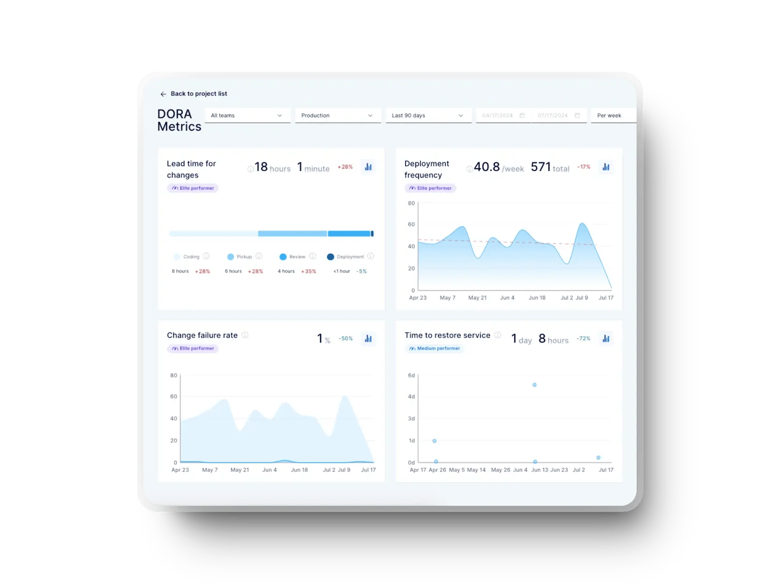
This set of measures comes directly from the Accelerate State of DevOps 2024 report. They show you how effectively your teams are delivering code into production, helping you track both speed and quality.
Here are the core benchmarks you should track:

These signals tell you whether your software delivery process is creating predictable outcomes or adding operational risk. A CTO dashboard turns them into leading indicators for board-level reporting.
Performance metrics alone don’t tell you how efficiently ideas move from concept to release. After all, your goal should be to reduce as much as possible the time to put an idea into the hands of the users. So, you also need to understand how smooth and sustainable your team’s flow really is.
These are the indicators to watch:
Axify’s Value Stream Mapping (VSM) tool brings these insights into one view so you can track how smooth (and fast) ideas move through each stage, from concept to delivery.
If you pay attention to the whole process, you can identify bottlenecks, opportunities, and trends over time like the ones below:

That way, you will continuously improve the flow that drives user value.
Tracking output without context doesn’t help you. The right metrics show how efficiently you turn effort into results. Here are the most valuable ones:
When paired with AI-driven insights, these numbers show process bottlenecks and predict delivery trends.

Finally, you need measures that tie engineering decisions directly to business strategy. Here are the essentials:
These metrics give Chief Technology Officers the language to justify investments and demonstrate the value of engineering beyond raw output.
Building a CTO dashboard requires a clear process and not just tools. Here are the steps and practices that help you set it up effectively and turn metrics into meaningful decisions for your leadership team.
Rolling out a CTO dashboard means building a structure that helps you track progress, report impact, and guide decisions. Here are the steps that matter most:
Reporting to the CEO or board is one of your most important responsibilities. A CTO dashboard helps you translate engineering outcomes into business terms, but the way you frame the data determines whether your message drives decisions or gets lost in detail.
Here are the best practices that will help you present with confidence and clarity.
Your board doesn’t want to hear about commits, pull requests, or story points. They want to know how engineering decisions affect growth, customer retention, and operational risk. This is where your dashboard must function as a translation layer.
For example, a reduction in average response time for customer-facing applications decreases churn and improves conversion rates. Similarly, improved deployment frequency can be tied to faster delivery of features that generate revenue.
Showing how each engineering improvement contributes to financial or strategic goals is essential. This lets you turn technical signals into board-level insights.
Raw metrics don’t mean much without context. If you report that your teams shipped 50 releases in a quarter, the board won’t know whether that’s good or bad. Instead, frame delivery data in terms of your company’s strategy.
For instance, if a strategic initiative is to expand into a new market, you can show how much engineering capacity was allocated to localization work. You can then present how those changes impacted time-to-market.
Tools like Axify allow you to categorize project tasks by initiative, which makes it easier to tie delivery data to specific objectives.
Here’s what that looks like in our Value Stream Mapping tool:

This helps you prove that engineering output aligns with business direction and not just activity for its own sake.
Boards need a frame of reference. If you say your lead time for changes is three days, you need to explain how that compares with peers. This is why benchmarking against sources like the Accelerate State of DevOps Report adds credibility.
For example, when you show that elite performers deploy multiple times per day, you can place your own deployment frequency against that scale. If you’re deploying weekly, the board immediately understands where you stand and what’s at stake. Benchmarks remove ambiguity and make your story sharper and more persuasive.
One of the hardest conversations you’ll have with a CEO or board is about capacity. They want to know how much work your teams can take on, but capacity fluctuates based on risks, dependencies, and unplanned work.
Your dashboard should point to risk-adjusted capacity.
For example, you can show how much of your team’s work time is consumed by bug fixes or handling support tickets. You can then explain how that workload impacts new feature delivery.
This helps you argue why simply adding more projects to the pipeline won’t accelerate outcomes. Framing capacity with risks included allows you to manage expectations and prevent overcommitment.
Engineering is typically one of the largest cost centers in the business. The board expects you to prove ROI. This doesn’t mean reducing the work of developers to cost-per-line-of-code. But it does mean showing efficiency gains and financial impact.
For example, if you reduce cycle time from three days to one, you can connect that to faster release tracking and earlier revenue recognition. If you cut incident recovery time from hours to minutes, you can quantify avoided downtime costs.
A dashboard that combines delivery metrics with financial models turns abstract progress into tangible return on investment.
Point-in-time data is misleading. A single bad week of deployments might look like a crisis if you report it in isolation, when in reality it could be an outlier. Similarly, a single strong month doesn’t prove lasting improvement.
Your board needs to see trendlines. Dashboards that provide rolling averages and visualizations (like a bar chart of deployment frequency over six months) tell a much more reliable story.
This approach helps you present whether process changes are driving consistent results. It also builds trust, because you’re not cherry-picking good weeks or hiding bad ones.
Finally, your reporting must include risks and how you plan to address them. Risks without solutions create anxiety, and solutions without risks sound unrealistic. The balance builds credibility.
For example, if you know that a critical dependency in your infrastructure performance could delay delivery, surface it in the dashboard and present the mitigation plan. If burnout signals are rising, show how you’re addressing them with workload adjustments or multi-team leadership strategies.
The goal is not to present perfection but to show proactive management of challenges. This approach positions you as a leader who identifies risks but also acts on them. Boards value transparency paired with clear action plans.
Even the best dashboards can fail if you approach them the wrong way. Here are the challenges and mistakes that often limit their impact.
Pulling information from too many systems without a clear framework creates noise instead of insight. And that’s not good.
For instance, one study found that 80% of global workers feel overwhelmed by data because it comes from scattered sources with poor access controls.
For you, this means board reporting takes longer, decisions are delayed, and signals get buried in noise. A CTO dashboard must centralize inputs from GitHub, Jira, CI/CD, and other technology assets into one place to cut through the overload.
Rolling out a dashboard without context leaves leaders confused. If your VP of Engineering reads a graph of lead time but doesn’t know whether it measures request-to-delivery or commit-to-deployment, the data becomes useless.
Training on interpretation is important. Without it, adoption suffers, and your investment turns into shelfware.
Dashboards can expose gaps between your strategic intent and what teams deliver. And most teams genuinely need that alignment. After all, only 29% of employees feel their leader’s vision always aligns with the organization’s direction.
So, if your dashboard shows throughput gains but teams still face bottlenecks, that disconnect grows. We suggest you involve engineering leaders in setting objectives and not just in reviewing results.
Vanity metrics make you look busy but don’t prove value. Story points are the classic example. As we explained in our story points vs. hours guide, they’re subjective, easy to game, and don’t connect to business impact.
Throughput, cycle time, and delivery trendlines give you a more reliable view of progress. If you rely on story points in board reports, you risk eroding credibility.
Some developers worry that dashboards are tools for surveillance. And that concern only makes the relationship with your employees worse in an already negative context: only 20% of U.S. employees strongly agree they trust their leadership today.
So, if your dashboard feels like micromanagement, morale declines. You need to position it as a tool for transparency and improvement, and not punishment. Showing metrics on flow efficiency or user experience helps teams see the value beyond oversight.
The final mistake is making dashboards too complex. If your setup looks like a business intelligence project in Power BI with dozens of charts but no narrative, you’ll lose your audience.
Boards don’t want 10 graphs. They want a story about risk, ROI, and outcomes. So, keep it focused on what moves the business forward.
You can build dashboards in generic business intelligence tools like Tableau or Power BI, but these options were designed for finance or operations. They show you charts but not context.
They usually lack the integrations, benchmarks, and engineering focus you need to lead complex delivery organizations. A CTO dashboard must be more than data visualization. It has to translate engineering activity into business outcomes and help you act on them.
Besides, you need a DevEx-focused solution because the experience and morale of your teams directly influence delivery results.
Here are the ways Axify delivers that advantage.
Your engineering system is a value stream, from idea to delivery. If you don’t see how that stream flows, you can’t remove delays or prove ROI. Axify maps your value stream so you can identify bottlenecks at every stage.

For example, you can track whether backlog refinement is taking weeks or if code review is dragging on too long. This is the difference between explaining to the board why new initiatives stall. It’s also about showing them exactly how much faster you can move after fixing the bottleneck.
Other tools might give you isolated metrics, but value stream management lets you show how all the work ties together. That perspective is critical when you need to balance new features, technical debt, and customer commitments.
Traditional BI dashboards can show you release counts, but they rarely connect those releases to delivery health. Axify tracks DORA metrics and places them in context.
For example, it’s not enough to say your teams deploy five times a week. You need to show whether those deployments align with business goals and how they compare with high-performing industry benchmarks.
Axify gives you both. This allows you to frame delivery as a competitive advantage instead of a cost center. When you can demonstrate that your teams recover from incidents in under an hour, the board sees resilience in action. If you also show that new features ship within days of approval, your reports move from activity tracking to strategic impact.
Engineering output cannot be separated from team health. If burnout or lack of psychological safety drives attrition, your delivery pipeline will collapse.
Axify integrates developer experience into the same dashboard as delivery metrics. That means you can measure flow efficiency, watch for burnout signals, and benchmark morale.

Axify’s Team Productivity Assessment gives you a clear, actionable view of all your software development teams through a structured evaluation across four key pillars.
The goal is to quickly understand each team’s strengths and weaknesses so you can target the right improvement initiatives and allocate resources effectively.
After all, if a quarter of your delivery capacity is going into firefighting, you can show that data and argue for investment in automation or tooling. No generic BI tool gives you that lens.
The four pillars are.

A CTO dashboard gives you a single view of engineering performance, strategy alignment, and risks. It lets you connect delivery speed, team health, and investment ROI to the outcomes your board cares about. Without it, you risk relying on scattered reports, vanity metrics, or narratives that don’t hold up under scrutiny.
With the right setup, you move from defensive reporting to driving strategy with evidence-backed insights. The result is better alignment, faster decisions, and stronger trust at every level.
To see how Axify helps you build that foundation, book a demo today.
It’s a centralized view of engineering performance, alignment, and risks. It connects delivery, team health, and business outcomes so you can show impact and not just activity.
Focus on DORA metrics, cycle time, and throughput for delivery. Add developer experience data and business alignment measures like OKRs and resource allocation. Boards expect outcomes and not just vanity metrics.
It combines delivery performance, developer health, and business alignment in one place. A good setup helps you answer CEO or board questions without pulling from six different tools.
Frame technical data in business terms. For example, show how reducing incident recovery time cut downtime costs or how faster deployment frequency supported new revenue streams.
Engineering dashboards track activity like commits or tickets. CTO dashboards focus on outcomes tied to strategy and ROI.
Show time saved, risks reduced, faster value delivery and try to translate this information into financial data. For instance, link shorter lead times to quicker revenue recognition or reduced attrition to lower replacement costs.