Delivery Performance
12 minutes reading time


Delivery feels slow even when output stays high. Lead time averages look stable, yet roadmap commitments slip and incident count increases. That pattern points to flow instability, not a simple capacity issue.
Value stream metrics make that instability visible. They show how work moves from ticket creation to production, where it queues, how long it waits for review or validation, and how variability in CI, deployment, or release processes affects lead time, change failure rate, and MTTR.
This article explains how to read those signals and use them to make tradeoffs across speed, stability, and capacity.
Let's dive in.
A value stream in software delivery is the end-to-end path from idea to production. It covers discovery, design, implementation, PR review, CI, testing, deployment, release, and post-release validation.
Mapped correctly, the value stream shows:
Value stream analysis connects flow metrics across the software development lifecycle — including lead time, process vs. wait time, WIP by stage, throughput, queue length, batch size, and review turnaround. Reliability metrics such as deployment frequency, change failure rate, and MTTR reveal how effectively that flow translates into stable, resilient production outcomes.
This makes it possible to trace cause to effect, for example: longer review queues increase lead time, larger batch sizes increase change failure rate and unstable releases increase incident volume.
This is why visibility matters. More than 68% of enterprises adopt value stream management tools to improve delivery visibility and operational performance.
Value stream metrics are system-level measures of how work flows through your delivery pipeline.
They quantify:
Common examples include lead time, cycle time by stage, wait time vs. process time, WIP, throughput, queue length, arrival rate vs. completion rate, and batch size.
Together, these metrics describe the shape and stability of your delivery system.
They show whether work is flowing at a sustainable rate or accumulating in specific stages, such as PR review, QA validation, or pre-release approval.
Remember: Value stream metrics do not evaluate individual productivity. They model the behavior of the system that produces releases.
This leads us to our next discussion.
Value stream metrics fall into five categories. Together, they show how work moves, where it slows, how risk accumulates, and whether value exits the system as expected.
Flow speed metrics describe how fast work moves from commitment to production. They measure elapsed time across defined SDLC boundaries, not individual productivity. Here are the core flow speed metrics you should track:
Together, these metrics tell you how responsive your system is to change and opportunity.
Flow stability metrics quantify variance in lead time, deployment intervals, and release outcomes. These are the core stability indicators you should review:

These metrics expose delivery risk and volatility before incidents escalate.
Flow efficiency metrics quantify how total elapsed time is divided between active work and waiting across defined SDLC stages.
These are the core efficiency indicators:
Flow efficiency: The ratio of active work time to total elapsed time from request to production. In most software delivery environments, measured flow efficiency falls in the single digits up to roughly 15%, meaning the majority of elapsed time is queue time.
Queue time vs. active time: Compares time spent waiting in backlog, PR review, testing, or approval states with time spent in active implementation or validation. This highlights stages where WIP accumulates.
Handoff delay: Measures elapsed time introduced when work moves between roles, teams, or systems, such as developer to reviewer or engineering to QA.
Idle time between stages: The gap between a work item entering a “ready” state and moving to “in progress.” Persistent gaps indicate capacity imbalance or unclear ownership at that stage.
These metrics quantify where elapsed time accumulates before release.
Throughput metrics measure how much work exits the system over a defined time period. These are the core throughput indicators:

Together, these metrics measure your team’s delivery capacity and the amount of work actually shipped over time. This allows you to compare planned commitments with realized output.
Quality metrics measure the reliability of work after it reaches production.
These are the key quality indicators:

Solving the frictions that these metrics indicate leads to higher user trust and operational stability. In combination, these five categories describe time, volume, variance, and reliability across the end-to-end delivery system.
Collecting metrics is easy, but using them to change system behavior is harder.
If you treat value stream data as static reporting, you get dashboards. If you treat it as decision input, you change outcomes. In practice, VSM metrics become operational when they are applied in the following ways.
First, use value stream metrics to diagnose bottlenecks. A bottleneck is the stage where work accumulates faster than it exits, causing queue growth. Lead time distribution, queue depth, WIP by stage, and handoff delay expose where work accumulates.
If one review stage has three times the queue time of implementation, the constraint is local to review capacity, approval policy, or batch size at that stage.
Second, identify delays that compound across stages. A two-day delay in review can push integration into a later testing window. If testing then has to wait for the next available release slot, the total lead time grows far beyond the original two-day delay. End-to-end VSM measurement makes these cascading effects visible.
Third, understand system behavior under load. If throughput rises and change failure rate rises with it, the system is operating beyond its stable capacity. Diagnosis requires tracing how batch size, WIP, review depth, and validation coverage affect release outcomes.
After identifying constraints, use metrics to determine where intervention will increase system throughput or reduce instability.
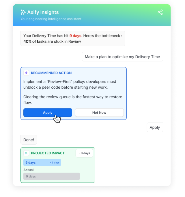
Axify operationalizes this approach by converting raw delivery metrics into constraint detection and change analysis. Instead of trying to analyze and interpret dashboards by yourself, engineering leaders receive:
See how our Axify AI Intelligence helps you interpret bottlenecks in your VSM below:

Operational changes are experiments, whether you label them that way or not. A new review policy, a branching strategy change, or an AI coding assistant rollout all alter system behavior.
So, the question that you should ask yourself is simple: Did the change actually work?
Before-and-after comparisons answer that. If cycle time dropped but rework frequency increased, you accelerated output while increasing downstream correction. If deployment frequency rose but incident frequency remained stable, the change strengthened continuous delivery practices.
Trend validation matters here, too.
We believe that one week of improvement does not prove structural change. So, you need sustained movement across lead time, variance, and quality indicators to confirm system adjustment. That discipline prevents premature scaling of unproven interventions.
When product, engineering, and leadership see the same VSM data, they:
Shared visibility changes how commitments are made. Roadmap scope, staffing changes, and release timing can be evaluated against current WIP, throughput, and lead time distribution before decisions are finalized.
It also clarifies tradeoffs. Increasing parallel work raises queue depth. Expanding batch size affects stability. Pulling a deadline forward may compress review and validation stages, which increases batch size and failure rate.
Alignment, in this context, means committing with full awareness of system capacity and constraint location.
You successfully adopted VSM metrics when they are shared and understood. That means:
Psychological safety also matters. VSM metrics should guide system improvement. You shouldn't use them to blame individuals.
Finally, framing metrics as decision support keeps the focus on action. When every signal connects to staffing, sequencing, investment, or risk, value stream metrics become operational tools.
Successful adoption looks like what the Business Development Bank of Canada (BDC) experienced when it implemented Axify’s value stream mapping across two development teams.
By making delivery flow visible and tying metrics to concrete workflow adjustments, the teams improved capacity by up to 24% and achieved up to +51% faster delivery.
“The Value Stream Mapping (VSM) we did has immense value. The team sees what happens, the impact of their actions, and areas for improvement.” - Josée GagnonIn other words, you should make sure that adopting VSM metrics leads to measurable results. If it doesn’t, you need to rethink your process.
Axify connects VSM metrics to delivery outcomes and surfaces the constraints that are affecting your workflow. We also help you make and implement decisions to improve that workflow right from our platform.
Axify continuously maps your delivery system using data from your connected tools.
You see cross-team flow and cross-service visibility across repositories, pull requests, review stages, and deployment phases. If review ownership shifts or queues grow between groups, the impact appears in the system view.
Metrics are updated continuously as work progresses.
Instead of reviewing quarterly summaries, you can observe how review queues expand this week, how aging work accumulates, and how rework trends change after a policy adjustment.
We also streamline the decision-making and decision-implementation process right from the platform.
Axify Intelligence detects emerging bottlenecks and explains which workflow stage is expanding. As a result, you gain a system-level view of where flow is slowing and recommendations to improve it.
That’s something isolated team reports or generic LLMs cannot do. In the next section, we’ll show you how it works.
Metrics are useful only when they shape action. Axify does not stop at showing what changed. It connects metric shifts to operational consequences.
For example, if lead time increases, the platform breaks it into sub-phases so you can see whether the delay stems from review backlog, pickup latency, or deployment gating. That distinction explains why the slowdown occurred and prevents incorrect interventions.
Of course, you need to make decisions based on those signals.
A review-stage expansion points to workload imbalance or WIP saturation. A deployment-stage delay signals release process friction. Instead of reacting broadly, you adjust the specific workflow constraint limiting throughput.
This is where Axify Intelligence comes in.
It translates internal delivery data into structured explanations and decision guidance to help you determine what to do next, like so:
AI investment creates a new layer of uncertainty. Following your VSM metrics can show you whether AI implementation was successful or not. For example, local coding speed can improve while system throughput remains unchanged.
More importantly, preexisting solid VSM practices lead to a more successful AI implementation.
The 2025 DORA report underlines this, as well::
|
“VSM turns AI into an organizational advantage: VSM moderates the relationship between AI adoption and organizational performance. Teams with mature VSM practices can channel the productivity gains from AI toward solving system-level problems.” |
In other words, AI alone produces modest gains (and sometimes, it can even lead to losses). However, AI combined with disciplined value stream practices amplifies its positive impact.
Axify operationalizes this analysis by linking AI adoption signals to delivery outcomes.
It tracks suggestion usage, acceptance rate, and tool coverage, then measures how those signals correlate with lead time distribution, throughput, rework frequency, change failure rate, and incident volume.
You can compare system behavior before and after AI rollout across two dimensions:


For example, if commit volume increases while rework frequency also increases after AI adoption, local acceleration did not improve system stability. If cycle time decreases and incident frequency remains stable, the intervention improved flow without degrading release reliability.
This distinction is critical when evaluating AI spend.
Instead of reporting usage metrics alone, you present measurable changes in lead time, stability, and throughput tied to system constraints.
Axify connects flow metrics to outcome signals used in leadership decisions. Operational visibility matters only when changes in cycle time, deployment frequency, or change failure rate are reviewed alongside release commitments, incident exposure, and delivery timelines.
These are the outcome dimensions Axify helps you monitor:
Because these signals update continuously, delivery performance can be evaluated alongside staffing, automation, and investment decisions.
For example, sustained queue growth at a validation stage may justify automation or capacity reallocation. A rise in rework or change failure rate may justify tightening validation gates before expanding scope.
Axify treats value stream metrics as operational inputs for intervention. The objective is not visibility for its own sake, but adjusting constraints that affect delivery speed, quality, stability and business outcomes.
Value stream metrics fail when they are interpreted without reference to system constraints and distribution behavior. The following mistakes distort decision quality:
Value stream metrics should reflect the primary source of delay or instability in your delivery system. Selection depends on delivery maturity, business priorities, and organizational structure.
Start with your operational maturity. Different systems need different signals.
Primary issue: limited visibility into flow.
Track:
At this stage, the objective is to identify where work sits idle, where ownership is ambiguous, and where backlog aging exceeds implementation time.
Primary issue: cross-team dependencies and uneven capacity across services.
Track:
In this phase, delays often occur at integration boundaries, shared services, or review stages. Metrics should reveal which phase accumulates backlog while others complete work.
Primary issue: structural delay from governance steps, compliance gates, or platform dependencies.
Track:
At this scale, delay often occurs after implementation is complete. The objective is to quantify delays introduced by policy, architecture, or coordination layers.
Metric selection should reflect the type of risk the organization must actively manage.
Primary concern: non-compliant releases.
Track:
In these environments, delays are often introduced by mandatory review and documentation steps. Measurement should quantify how governance gates affect lead time and recovery behavior. The goal is to maintain compliance while preventing approval stages from becoming unmanaged bottlenecks.
Primary concern: responding to market demand slower than competitors.
Track:
In high-growth phases, backlog size and parallel work increase. This often leads to larger batch sizes, longer review queues, and more integration defects. Measurement should determine whether rising demand is degrading flow efficiency or release stability across the system.
If stability declines or lead time variance widens as volume increases, iteration speed is deteriorating even if raw throughput appears higher.
Primary concern: production instability and recovery cost.
Track:
In these systems, increasing throughput is secondary to controlling failure probability and recovery duration. Measurement should determine whether batch size, deployment cadence, or validation depth affect release durability. Following the stability metrics we recommended helps you make decisions about automation, validation gates, and rollback strategy before expanding scope.
Finally, measurement must reflect how your teams are organized.
Platform teams support multiple product lines. Metrics should quantify dependency load and service reliability impact.
Track:
If downstream teams wait on platform work, for example, backlog age and queue growth will expose the capacity gap. These signals inform staffing and automation decisions.
Product teams own delivery within a defined product line.
Track:
Rising scope churn or widening lead time spread indicates planning instability or sequencing problems. These metrics connect delivery behavior to roadmap reliability.
Shared service teams often receive requests from multiple lines without clear capacity visibility.
Track:
These metrics show whether centralized ownership introduces structural delay and whether redistribution or staffing changes are required.
A healthy value stream is defined by stable system behavior across time and load. It maintains predictable lead time, consistent release cadence, and controlled failure rates while handling normal variation in demand.
The following signals indicate delivery health.
Throughout this article, you saw how flow speed, stability, efficiency, throughput, and quality expose constraints, variance, and second-order effects.
Beyond visibility, value stream metrics should help you decide how to allocate effort, sequence work, and manage risk.
When you use them correctly, these signals guide staffing, AI investment, and release strategy. If you stop at the visibility level, VSM metrics can easily become mere reporting noise.
If you want system-level visibility that connects metrics to concrete decisions, contact Axify and see how your delivery data can drive action.
Value stream metrics measure how work moves from idea to production across your entire delivery system. They focus on system flow, stability, efficiency, and quality rather than individual output. As a result, you use them to identify constraints, manage risk, and guide decisions.
Value stream management uses metrics that reflect end-to-end movement and system behavior. These include lead time, process time, flow efficiency, variability, queue time, deployment frequency, change failure rate, rework rate, throughput, and recovery time. Together, they show how changes in one stage affect downstream capacity, predictability, and operational risk.
You should track only the KPIs that directly influence strategic decisions. In most cases, 5-10 well-chosen system-level indicators are sufficient. Fewer, clearly interpreted metrics drive better action than broad dashboards with no prioritization.
LT stands for lead time, which measures the total time from when a stakeholder makes a request until the feature is running in production and usable by the end user. PT stands for process time, which measures the time actively spent working on the item. Comparing them helps you see how much of your timeline is productive work versus waiting.