Delivery Performance
16 minutes reading time


You already track tasks, deadlines, team performance, and everything else. But are you getting the complete picture of your current sprint delivery status? Sprint after sprint, you rely on reports to measure progress, but they don’t always tell you why or how to fix delays.
The right insights can help you work smarter, not harder. Instead of just looking at completed tasks, you need a deeper understanding of what’s slowing you down.
In this article, you’ll learn how to improve your Scrum reporting and get better visibility into your team’s performance. Let’s get started.
Scrum reporting helps you track progress, spot blockers, and improve your team's efficiency by analyzing key sprint data. With 87% of agile teams using Scrum, it remains the most widely adopted framework.
Plus, 78% of Scrum users would recommend it to others, proving its effectiveness in software development. Strong progress reports keep your team aligned and help you refine your future sprints.
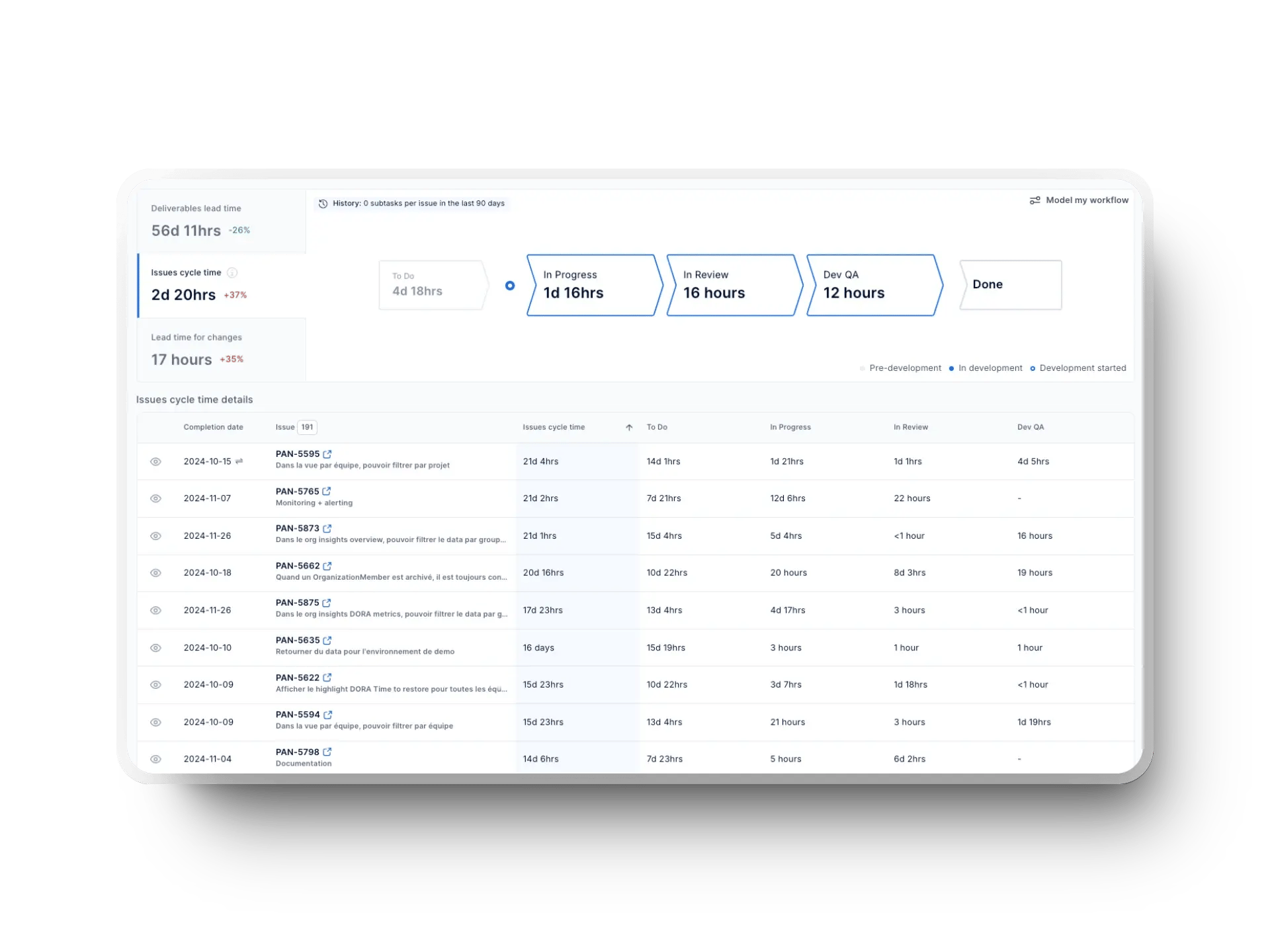
Did you know that Axify automatically compiles your Scrum reports and gives you a complete view of your team’s sprint progress and performance metrics? Easily track what’s working — and what’s slowing you down — so you can continuously improve delivery.

Scrum reports give you a clear visual representation of your team’s current progress, help you track sprint performance, and find areas for improvement. If you analyze key data, you can refine sprint planning, remove blockers, and keep work aligned with Agile principles.
Teams that fully implement Scrum and estimate workloads see a 250% boost in work quality compared to those that don’t use any estimating methods.
Whether you're a product owner or a developer, you need to make better decisions and improve your team's workflows. Instead of guessing, you want to rely on real insights that keep your team moving forward with every sprint.
But are Scrum reports really the best way to get those insights? Let’s analyze them and see if we can offer better alternatives.
To keep your team on track and improve efficiency, you need the right reports to measure progress, identify blockers, and refine your approach, sprint over sprint. Here are the most common Scrum reports that give you deeper insight into your team’s performance.
A burndown chart helps you track completed work versus what’s left in a single sprint. It gives you a clear picture of whether your team is on track to meet its sprint goals. After each daily Scrum, the chart is updated with completed story points and forms a downward trend.
However, traditional burndown charts have a major flaw—they don’t distinguish between planned work and unplanned tasks added mid-sprint. This can make it difficult to understand why your project is off track. As a side note, that’s why Agile reports include Burn Up charts instead.
How to Set Up a Burndown Chart
Here’s a simple way to set up your burndown chart:
How to Read and Interpret a Burndown Chart

Here's what everything means so you can easily read this chart:
Why Axify Gives You Better Insights
Traditional burndown charts only show surface-level trends. Axify goes deeper by allowing you to make data-driven decisions and analyze bottlenecks in real time.
Instead of just tracking completed tasks, Axify’s Value Stream Mapping Tool shows you your workflow inefficiencies and helps you improve sprint execution. This means you get a more complete progress report, not just a basic task tracker.
Sprint velocity measures how many story points your team completes per sprint. Story points are metrics we don’t advocate for, as we’ve explained before. However, we do encourage you to follow velocity because it helps you estimate future workloads based on past performance. It’s also a key tool in sprint backlog management.
However, traditional velocity tracking has a major flaw because it only looks at past performance and assumes that future trends will be similar. This can lead to inaccurate planning and unrealistic expectations.
Here’s a quick way to set up sprint velocity in Scrum:

Here's what everything means so you can easily read this chart:

Tracking velocity alone won’t help you pinpoint all of your workflow issues. Axify offers the needed context; together with velocity, you can easily analyze cycle time, throughput, flow efficiency, and other engineering metrics.
Instead of guessing why your team’s velocity changes, Axify shows your real effort per project so you can remove bottlenecks, improve sprint capacity, and make better forecasts.

A Burn-up chart helps you track the amount of work completed versus the total work required, including any changes in scope.
Unlike burndown charts, which only show the remaining work, Burn-up charts clearly represent progress and shifting requirements. This makes them a great tool for Scrum teams managing long-term projects or frequently changing priorities.

Follow these steps to set up your Burn Up chart:
Here's what everything means so you can easily read this chart:
And here’s how to interpret it:
Traditional Burn Up charts don’t account for workload distribution across multiple projects, making it difficult to balance competing priorities.
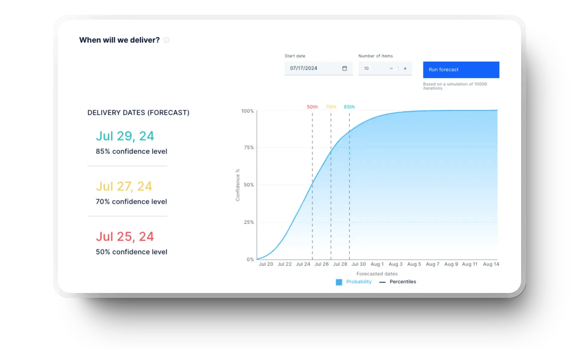
Axify fixes this with its Forecast Delivery Tracker, which gives you real-time visibility into your progress, scope changes, and resource allocation. Instead of guessing where your team’s time is going, Axify allows you to make better decisions and improve your average sprint planning accuracy.
A defect trend chart helps you track the number of defects opened (activated) and closed (terminated) over time. It gives you a clear picture of whether software quality is improving or declining. If you monitor these trends, you can identify patterns, spot recurring issues, and take action before defects become major problems.

Here’s how you can set up and track defect trends effectively:
Here's what everything means so you can easily read this chart:
Traditional defects trend charts only track the number of defects. They don’t show how much time your team spends fixing defects versus building new features. They are also primarily lagging indicators because they only reflect issues after they occur. While past defect trends can suggest probabilities, they don’t capture real-time risk factors or changes in development practices that influence future defect rates.
Axify allows you to track PR merge time, throughput, and DORA metrics and helps you identify hidden bottlenecks. Instead of counting defects, Axify gives you key reports highlighting trends affecting overall development efficiency.

Apart from the core reports, you can use other reporting tools to gain even deeper insights into your team's efficiency. These reports help you track your workflow, spot delays, and improve overall performance. Here are some valuable Scrum reports to consider:
Using these extensive reports alongside your daily Scrum reports ensures you track the right metrics and make informed decisions. Combined with historical documentation, they provide a complete picture of your team's progress.
Scrum reports help you track progress, but you need to focus on key Scrum metrics to get a complete view of your team’s performance. These metrics go beyond basic reporting and give you deeper insights into your efficiency, quality, and workflow.
Here are some important ones to track:
%20in%20Axify.webp?width=1920&height=1440&name=work%20in%20progress%20(WIP)%20in%20Axify.webp)
While these metrics are useful, they don’t always show the full picture. Axify takes it further by incorporating DORA, flow, and SPACE metrics, giving you a deeper understanding of your productivity, team collaboration, and delivery efficiency.
Axify helps you identify trends, detect inefficiencies, and take action before problems slow your team down. Use our dashboards to analyze KPIs and get a complete view of your development process.
Instead of just looking at numbers, Axify helps you see patterns, spot bottlenecks, and make better decisions to improve your team’s performance.
Generating a Scrum project report helps you track progress and document key sprint details. Many Scrum tools automate this process, but you can also generate reports manually.
Here’s how you can do it:
Scrum reports help you track progress, spot bottlenecks, and improve your team's performance. From burndown charts to defect trend analysis, these reports give you valuable insights, but have limitations.
That’s where Axify comes in.
Axify goes beyond traditional reporting with real-time data on flow efficiency, bottlenecks, and team performance. Whether you use Scrum, Kanban, or another Agile framework, Axify gives you a framework-agnostic, clear picture of your development process.
Take control of your team’s productivity with smarter insights. Book a demo with Axify today and see the difference for yourself!
