Delivery Performance
12 minutes reading time


Delivery pressure typically builds quietly. Cycle times stretch, handoffs pile up, and decisions rely on dashboards that describe symptoms without explaining causes. That’s why value stream mapping tools matter at all stages. They sit at the point where visibility either turns into action or stays cosmetic.
In real software delivery, that distinction becomes obvious fast. Ownership shifts, work runs in parallel, and CI/CD pipelines introduce feedback loops that static models can’t keep up with. The question isn’t whether you can visualize the flow, but whether your tooling helps you make better delivery decisions when reality changes.
That’s what this article is about.
Let's get started!
|
Tool |
End-to-End Value Stream Coverage |
VSM Metrics Tracked |
Constraint & Bottleneck Detection |
Live vs Manual Mapping |
Integrations |
Pricing Tier |
Best for (VSM context) |
|
Axify |
Full end-to-end, cross-team, cross-system |
Cycle time, throughput, WIP, wait states, flow efficiency |
System-level root cause + decision guidance |
Live, VSM-native |
Issues, repos, CI/CD |
Free + paid |
Continuous, operational VSM |
|
GitLab |
Repo-level only |
Stage time, handoff time |
Stage-level bottleneck insights |
Semi-automated (repo-centric) |
GitLab-native |
Free + paid |
GitLab-centric flow tracking |
|
CloudBees |
CI/CD pipeline-centric |
Lead time, wait time, WIP |
Surfaces delay patterns through flow metrics |
Semi-automated (VSM is inferred, not explicitly mapped) |
CI/CD-heavy stacks |
Custom |
CI/CD-centric flow analysis |
|
Planview Viz |
Portfolio-level abstractions |
Lead time, bottlenecks, WIP |
Flow bottleneck visualization |
Semi-automated |
Planning + DevOps tools |
Custom |
Portfolio-level flow modeling |
|
Lucidchart |
Whatever you draw (manual) |
None (manual only) |
No automated bottleneck detection |
Manual only |
Docs, wikis |
Free + paid |
Early-stage conceptual VSM |
|
LinearB |
Engineering-only |
PR flow, review time, cycle time |
Local bottleneck signals (PR review queues & stage delays) |
Semi-automated (Live signals, but no explicit VSM map) |
Git, issues, chat |
Free + paid |
Engineering-level flow |
|
Jellyfish |
Jira-based lifecycle |
Stage duration, flow |
Limited/ indirect; not VSM-specific bottleneck detection |
Semi-automated (planning-level) |
Jira + Dev tools |
Custom |
Org-level delivery visibility |
|
Waydev |
Repo-based workflows |
PR-level flow |
Metric trends only |
Semi-automated (Live signals, not a VSM map) |
Git, CI/CD |
Paid |
Repo-level flow signals |
|
GetDX |
Stage + sentiment-based |
Flow metrics |
Detects delays in stages but not formal bottleneck analysis |
Semi-automated (Stage + sentiment signals, not true mapping) |
Dev tools + surveys |
Custom |
Flow + experience signals |
|
Code Climate Velocity |
SDLC-level (team-focused) |
Flow trends |
Indirect; not formal VSM bottleneck detection |
Live metrics, no VSM map |
Git, CI/CD, issues |
Custom |
Team-level flow trends |
A value stream mapping tool is a software that lets you visualize how work actually flows through your delivery system and where bottlenecks and delays emerge. In practice, the tool connects data across the software delivery pipeline, traces work through its current states, and reveals where time, effort, or ownership breaks down.
More importantly, it links flow signals to improvement opportunities, helping teams identify which constraints matter most and what delivery decisions to make as the system evolves..
Let’s say you want to improve lead time, for example. This depends on closing feedback loops across teams, reviews, and releases, as well as reducing how long work waits between steps in the development process. A good VSM tool highlights the points where work waits, gets reassigned, or loses context, and makes those delays visible in relation to real delivery decisions.
That clarity has proven a measurable impact in plenty of real delivery environments.
For example, after applying VSM to redesign an SDLC, a Lean IT case study reported delivery time dropping from 210.5 days to 137.5 days (a 34.7% reduction), which shows how system-level insight changes outcomes when applied to real workflows.
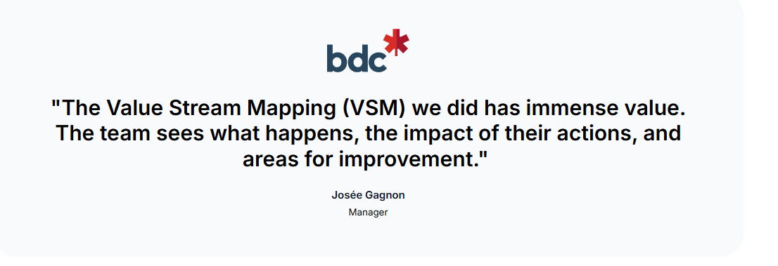
One of our own clients, The Development Bank of Canada, implemented value stream mapping for two of its teams and reduced delivery time by 50%.
But more on that below.
Next, let us tell you how we evaluated the best value stream mapping software.
We evaluated these VSM tools based on their ability to support real delivery decisions that directly impact lead time, handoffs, and where delivery delays occur. When we evaluated the best VSM tools, we thought of this quote:
The goal here is not to restate what these tools claim to do on their own websites, but to assess how they behave once connected to real delivery systems. From that perspective, these are the criteria we used to assess each platform.
A tool has to reflect reality (PRs, queues, reviews, CI, deployment friction, ownership changes, etc.) before it can support decisions. And based on our experience, that starts with end-to-end visibility across work intake, development, review, and release.
Coverage inside a single repo or team is not enough when flow breaks at handoffs. Cross-team and cross-system mapping shows whether a process map stays accurate as ownership shifts and work moves across services.
Just as important, value stream mapping must stay up to date. Static maps quickly fall out of sync as work moves through stages, while continuously updated mapping keeps the value stream aligned with how work actually flows day to day.
Metrics matter a lot if they explain movement in the system. Existing flow metrics need to connect across stages so bottlenecks can be traced to specific queues, policies, or dependencies. This is something we look for immediately when evaluating tools.
Waste* and wait states should surface as measurable signals, too. That distinction affects decisions because identifying wasteful practices without tying them to time loss or throughput impact rarely changes planning behavior.
*Side note: “Waste” is classic Lean language, but that’s where the concept of VSM originates. In software delivery contexts, waste and wait states appear as queues, rework, review delays, blocked work, reopenings, rollbacks, etc.
Leaders shouldn’t need to reverse-engineer charts. Tools were evaluated on whether they can explain why metrics change and give you potential solutions, rather than just flagging variance.
Root-cause analysis, context-aware recommendations, and natural-language queries reduce manual analysis and help teams make better decicions. Continuous insight across teams, repos, and services matters here, since isolated explanations rarely survive complex software pipelines.
Dashboards need to support real conversations: planning, prioritization, staffing, dependency resolution, release confidence. That’s where trend analysis matters, because patterns over time show whether a change actually holds beyond a single sprint or fades under pressure.
And when delivery signals are brought into leadership reviews, export and reporting options become part of the evaluation. Clear linkage between trends and operational performance keeps those discussions factual, reduces interpretation gaps, and limits debate driven by unfounded opinion.
Trust starts with data quality, because every insight depends on how reliably signals flow from real systems. Deep integration with issue trackers, CI/CD systems, and repositories reduces manual upkeep and limits drift as processes change.
And while broad coverag
e can look appealing, automated ingestion matters more in practice. That's because manual stitching introduces lag and inconsistency that quietly erode system-level insight.
Adoption depends on friction. Setup effort, learning curve, and collaboration features influence whether teams engage with a tool or work around it. When interpretation feels heavy, usage drops and insight decays. This is a pattern we see repeated across organizations.
With that in mind, we evaluated the tools themselves.
The best value stream mapping tools in 2026 are Axify, GitLab, CloudBees, Planview Viz, Lucid Chart, and others. Each supports a different value stream mapping process, but only some influence improvement outcomes once delivery pressure rises. With that context set, these are the tools reviewed next.
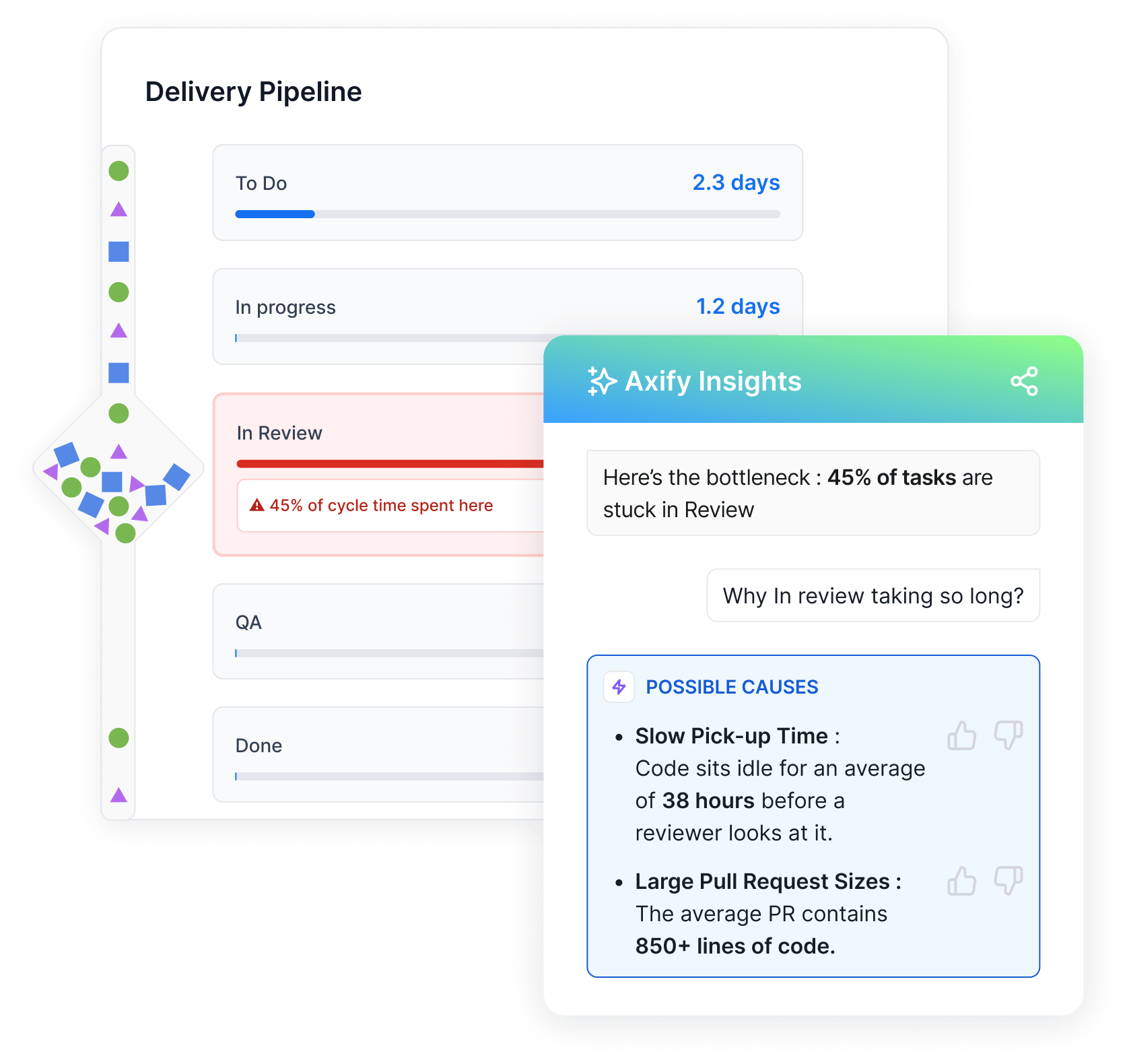
Axify’s value stream mapping shows how work actually moves through your delivery system, using live data from the tools your teams already use. It tracks flow metrics such as work in progress, cycle time, and time spent in each state, across planning, coding, review, and release.
That way, you can see where work queues, slows down, or gets blocked.
Here's a snapshot of Axify’s VSM:

Acting on VSM data leads to tangible results in practice.
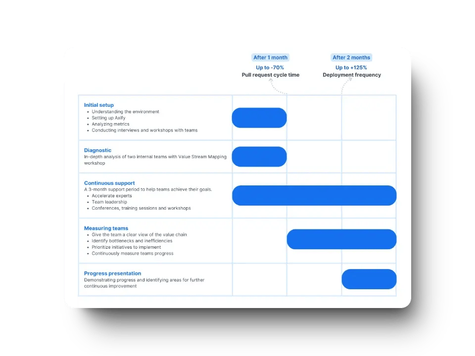
Take the example of The Business Development Bank of Canada. After Axify’s value stream analysis highlighted where time was being lost, teams adjusted their workflows and decision-making, reducing delivery time significantly.
In fact, time in pre-development activities dropped by 74% and QA time by 81%.
Here’s a closer look at our strategy:
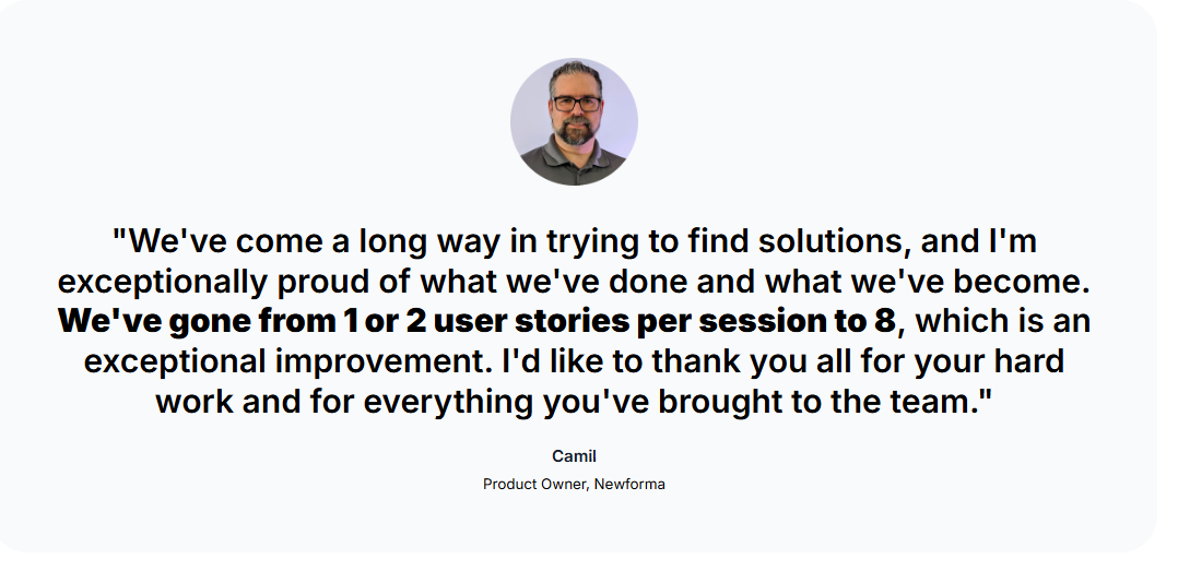
We also helped Newforma deliver 22x more often, decreasing delivery time by 95%. The strategy was simple: identify bottlenecks using our VSM, address specific constraints such as QA, and optimize the development process by reducing batch size and delivering smaller increments more frequently.
If you want similar results, make sure to book a demo with Axify today.
Pro tip: Visibility matters, but Axify goes beyond it by helping teams make better decisions using delivery data.With Axify AI, you get insight that turns into guidance, so delays come with context and actionable insights to fix them.
Pros:
Cons:
Pricing: There's a free tier available, and the paid plan starts at $19 per month per contributor.
Website: axify.io
GitLab includes value stream analytics inside its DevSecOps platform. This means that mapping relies on data already generated through issues, merge requests, and pipelines.
The platform measures how work moves from planning through deployment by tracking event timestamps across projects. As a result, visibility stays tied to how GitLab records activity rather than external interpretation.
In practice, this approach has been used at scale. Hilti reported an increase in deployment speed after standardizing delivery workflows inside GitLab and using its analytics to surface delays across teams.
Pros:
Cons:
Pricing: There's a free tier available, and paid plans start at $29 per user/month.
Website: gitlab.com

CloudBees provides value stream management inside an enterprise delivery platform built around complex CI/CD environments. The platform aggregates data across pipelines, tools, and teams to represent how work moves from planning through release. That structure supports tracing work across the full product journey rather than within isolated repos.
In large environments, this model has been applied to standardize delivery visibility. CloudBees has been referenced by enterprises using Jenkins-based stacks to align pipeline activity with governance and reporting needs.
From an evaluation standpoint, CloudBees frames value streams through orchestration and control layers. That approach focuses on traceability across delivery stages and aligns metrics with business KPIs, especially where compliance and auditability shape delivery flow.
Pros:
Cons:
Pricing: Custom quote.
Website: cloudbees.com

Planview Viz analyzes delivery systems by aggregating activity across planning, development, and service tools into a single flow model. Work is traced across teams and stages to surface patterns that affect throughput and predictability.
In enterprise settings, this model has been applied to align delivery signals with planning and portfolio oversight. At TUI Group and the Bank of New Zealand, Planview Viz has been referenced for identifying emerging constraints before they affected commitments.
Pros:
Cons:
Pricing: Custom quote.
Website: planview.com
Lucidchart supports manual value stream mapping through a shared diagramming workspace rather than live delivery data. Process steps, delays, and handoffs are modeled visually using templates that represent how work moves from concept to release.
In practice, this approach is typically used during alignment sessions to document the current process. Teams adopting early VSM practices may use it before introducing automatic, data-driven delivery analysis.
From an evaluation perspective, this type of mapping remains primarily descriptive. The tool captures information flow as it is drawn and relies on real-time collaboration to keep diagrams aligned across stakeholders.
Pros:
Cons:
Pricing: There's a free tier available, but the paid team plan starts at $10 per user/month.
Website: lucidchart.com
Pros:
Cons:
Pricing: There's a free tier available, with paid plans starting at $29 per contributor/month.
Website: linearb.io
Jellyfish includes a Life Cycle Explorer module that maps how work items move through software development using Jira and connected development systems. The tool visualizes status transitions, queue times, and handoffs to show how issues progress across planning, development, review, testing, and release.
Teams can apply these views to compare expected versus observed timelines and to examine trade-offs between speed and quality across stages. The module operates inside Jellyfish’s broader engineering management platform, so delivery flow data sits alongside staffing, investment, and workload views.
Pros:
Cons:
Pricing: Custom quote.
Website: jellyfish.co
Pro tip: You can check out our guide on the best Jellyfish alternatives to find tools that might be better for your team.
Waydev presents workflow mapping through time-based analysis rather than visual diagrams. It uses repository and project data to outline how work moves from commit to production.
The platform structures delivery stages using Git, pull requests, and CI/CD events. Then it aligns them into a measurable sequence across coding, review, testing, and release.
This approach frames the workflow as a timeline with stage-level duration and throughput signals. As a result, delivery behavior is inferred from recorded system events rather than manually defined process maps.
Pros:
Cons:
Pricing: Paid plans start at about $29 per contributor monthly.
Website: waydev.co
GetDX approaches workflow and value stream analysis by combining workflow telemetry with developer perception data through its DX25 framework. The platform correlates delivery signals from repositories, CI/CD systems, and issue trackers with structured experience insights to show how work moves and where developers encounter friction.
In practice, stages such as coding, review, and waiting are viewed alongside reported friction points, connecting process behavior with developer experience rather than relying on system metrics alone.
Pros:
Cons:
Pricing: Custom quote.
Website: getdx.com
Code Climate Velocity visualizes the software delivery lifecycle end-to-end using workflow and repository data. The platform aggregates signals from version control, CI pipelines, and issue trackers to show how work moves across coding, review, testing, and release.
From there, delivery stages are viewed as timelines rather than isolated metrics, which supports analysis of flow patterns across teams.Historical trends are preserved to compare changes over time and assess whether adjustments lead to sustained changes in delivery behavior, not just one-off improvements.
Pros:
Cons:
Pricing: Custom quote.
Website: codeclimate.com
Pro tip: Feel free to check out our guide on what to look for in an alternative to Code Climate Velocity.
ROI only shows up when delivery data drives real decisions: what gets delayed, what gets split, what gets staffed, and what gets cut. With that context in mind, here’s how ROI actually materializes in practice.
As we said above, ROI becomes visible when a tool moves beyond observation and starts influencing behavior. In real delivery environments, that influence tends to cluster around a few concrete outcomes.
These are the primary ways ROI shows up when a VSM tool is used to drive real delivery improvements:
ROI weakens when tools stop short of decision support. Visualization alone creates alignment, but without decision support it has limited impact on actual delivery performance.
Additionally, heavy reliance on manual updates causes insights to fall out of sync with real delivery data, eroding user trust over time. When tools are disconnected from actual delivery systems, they surface clean-looking numbers that might fail to reflect what teams are experiencing.
In essence, ROI depends on clarity, data accuracy, and the ability to act on insights. When those align, investment translates into measurable improvement.
Choosing a value stream mapping tool works best when the decision starts from the delivery reality in your company (handoffs, queues, reviews, dependencies, rework).
The right choice reflects how work actually moves, where data already exists, and how decisions get made during incidents, deadline slips, or exec reviews.
Here’s a practical decision framework to guide that evaluation.
Team size shapes how much coordination the tool must support. Smaller teams typically need fast setup and clear signals. Larger organizations require visibility across dependencies, shared services, and parallel streams. Based on our experience, tools that struggle with cross-team complexity rarely change outcomes.
Data quality determines trust. If delivery data lives across multiple systems, the tool must ingest it without manual stitching. Otherwise, insights lag reality.
We recommend prioritizing platforms that pull directly from live delivery data rather than curated snapshots (i.e., exports, spreadsheets, manual tagging).
Metrics maturity affects how insights get used. Early-stage teams need basic visibility on where time accumulates. More mature teams also need to understand causes, second-order effects, and intervention trade-offs.
Side note: Of course, all teams need to understand these causes and trade-offs. The difference is that early-stage teams first need stable visibility before deeper analysis becomes actionable.
So, from what we’ve seen, tools that only report numbers tend to stall faster.
Change follows insight only when teams can act on it. If workflows shift frequently, rigid models slow progress. This is where framework-agnostic tools perform best.
We believe tools that adapt to your process, rather than forcing one, are more likely to support sustained improvement. Axify follows this approach, keeping insights aligned with how software development actually evolves.
Customization signals long-term fit. The ability to adjust stages, thresholds, and mappings keeps the tool relevant as the software development process evolves.
The best value stream mapping tool in 2026 is Axify. The choice becomes clear when explaining outcomes and guiding decisions matters more than static visualization. Across real delivery environments, consistent gains come from tools that explain why delays happen, connect signals across systems, and guide the next decision.
As the software development process evolves, insights and data must adapt without manual maintenance to remain relevant. That adaptability is what makes them usable for real planning and for decisions that improve team performance.
So if you are responsible for improving software development team productivity across your organization, book a demo with Axify to see how it supports better decision-making.
