Software Development
21 minutes reading time


You’ve probably felt that mix of pressure and uncertainty during a sprint. At that time, you’re planning your next move, juggling deadlines and trying to make sense of what your team can actually get done. You want clarity, but all you see are moving parts and shifting priorities.
That’s where velocity metrics can help, not as a magic number but as a way to see your real pace and understand what’s holding you back. In this article, you’ll learn how to use these metrics to guide better decisions, refine your planning process and bring more confidence to your Agile team’s workflow.
Now, all of that sounds good, but what does velocity as a KPI mean?
Velocity as a KPI is a variable you use to measure how fast your team completes work within a set time frame. It gives you a clear picture of how quickly you’re moving through your product backlog and whether you’re on pace to meet your delivery goals.
You can track your current velocity to spot patterns, rely on average velocity for better planning, and use historical velocity to forecast when you’ll actually deliver. This kind of measurement helps you make informed decisions about project timelines and team capacity. With consistent tracking, you’ll adjust faster and plan smarter.
Before you move forward with using velocity, it’s important to understand how it differs from productivity; after all, speed alone doesn’t equal progress.
Velocity measures how much work your team completes in a given time. Productivity indicates how efficiently and effectively work is done. You might finish a lot of work during a two-week sprint, but if half of it requires rework, your productivity is low.
The problem is that rework can cost between 10 to 100 times more than getting requirements right the first time, depending on project size.
Think of it as writing thousands of lines of code that don’t solve the right problem. Your output is high, but the outcome falls short. Velocity helps with the measurement of progress, while productivity focuses on real impact. You need both to understand team performance and make smart decisions that lead to better delivery and value.
Now that you know what velocity is, let’s break down the units behind it and how you can calculate it.
Velocity helps you understand how much work your team finishes in a specific time frame. But to make that insight useful, you need to know how to measure it.
In Axify, metric units for velocity are the number of tasks completed in a unit of time. You’ll find other teams measuring story points instead, typically linked to techniques such as the Fibonacci sequence.
While that works for some, Axify doesn’t encourage story point estimates because they’re subjective and inconsistent. You get better clarity by focusing on completed items. So, here are the most common ways to measure velocity and how they work in practice.
Scrum teams typically measure velocity by tracking story points. The formula for calculating this is:
|
Velocity = Total Story Points Completed ÷ Number of Sprints |
This gives you the average sprint velocity. It helps with planning future sprints by showing your team's pace over time.

Velocity measures how much your team actually completes. Capacity, on the other hand, estimates how much work your team could finish during a sprint based on hours or availability. It’s a planning tool, not an output metric.
Agile frameworks use another formula to calculate velocity over a larger window of time, which is:
|
Agile Velocity = Number of Completed Backlog Items (or User Stories Completed) ÷ Total Number of Days Across Sprints |
This gives you a rate of delivery that can help you work with Agile metrics, align with project goals, and support effective sprint planning. Whether you're tracking work in story points or completed tasks, the goal is to give your development team clear, consistent insight to move forward.
Once you’ve got a grip on the numbers, it’s helpful to look at the key metrics that affect it in real scenarios.
Velocity connects to several metrics that give you a clearer view of how your team works. Here are the key ones that help you track actual velocity and spot patterns that lead to process improvement.
Cycle time is the time it takes for your team to complete one task, starting when work begins and ending when it's done. If you pick up a task on Monday and finish it on Thursday, that task has a four-day cycle time. It’s a straightforward way to measure how fast work moves across your board, which gives you insight into how your team flows during a sprint.

Cycle time connects directly to velocity. Velocity tells you how much you finish in a sprint. Cycle time shows how long each task takes. If your cycle times are shorter, you’ll likely complete more tasks in the same sprint, which increases your actual velocity.
Here’s how it plays out:
Team A:
Note: Cycle time doesn’t divide evenly by the number of tasks, since multiple stories may be in progress at once and vary in complexity.
If they reduce cycle time to 2 days, they could complete up to 10 tasks in the same 2-week sprint and double their velocity.
Team B:
Spotting these delays helps you figure out exactly why your velocity is slipping.
Focusing on shorter cycle times helps you improve predictability, remove blockers, and work more efficiently without burning out your software team.
And that matters more than ever. One study found that 83% of developers experience burnout, often due to long hours and constant pressure to deliver. Another showed that working 60+ hours a week doubles your risk of burnout.
Smaller, faster cycles give teams room to breathe. You still deliver, just without the chaos.
Throughput is the number of tasks your team completes in a set time frame, typically per sprint or week. It measures how many items cross the finish line, regardless of their size or complexity.
Unlike velocity, which typically ties to story points, throughput simply counts completed items. It’s one of those key performance indicators that tells you how much is getting done, not how heavy the work was.
Here’s how it plays with velocity. If your throughput increases and task sizes stay the same, then your velocity goes up, too. But if you’re slicing work into smaller chunks, your throughput might rise while your velocity stays flat.
Team A used to complete six tasks per sprint. After improving handoffs and reducing idle time between steps, they now finish nine tasks in the same sprint, with no change in task complexity.
➡️ That’s a real gain in velocity: more work delivered in the same time frame, without extra stress or longer hours.
Team B used to complete 4 larger tasks per sprint. Then they started splitting work into smaller pieces, so now they finish 8 smaller tasks per sprint. But the total complexity and value delivered haven't changed.
➡️ Throughput went up, but velocity, if you measure it by impact, stayed flat.
Throughput gives you valuable insights into your flow to help you spot blockers and push for continuous improvement.
Flow efficiency shows you how much of a task’s time is spent on real work versus waiting around. It’s calculated using this formula:
|
Flow Efficiency = (Active Time ÷ Total Time) × 100 |
If a task takes 10 days to complete but only 2 days were spent actively working on it, your flow efficiency is just 20%. That means the other 80% of the time, the task was sitting idle, waiting on reviews, blocked by dependencies, or stuck in queues.
Low flow efficiency can quietly eat away at your progress. It slows down your cycle times, which drags down your velocity. If you're finishing fewer tasks because most of them sit untouched, your team productivity and delivery speed suffer. After all, studies show that developers spend just 52 minutes per day coding and 41 minutes as editors (reading code, tackling pull requests, or looking at documentation). The other about 6 working hours per day are chipping away at their productivity.
Team A:
This idle time adds up across tasks, slowing everything. Because so much time is spent waiting, only 4 tasks are completed per sprint.
That slow pace limits how much value they can deliver, no matter how skilled the team is.
Team A improves handoffs and removes blockers:
Tasks move faster, with fewer delays. Now:
That’s double the delivery output, just by smoothing the flow, not working longer hours.
➡️ If you improve your flow efficiency, you make better use of the time you already have without pushing your individual team to work longer hours.
In SAFe, team capacity is how much work your team can take on during a sprint. Velocity is how much work your team actually completes. Think of capacity as your available space and velocity as your actual output.
If you’ve used Axify, this is similar to Work-in-Progress (WIP), which shows you whether your team is stretched too thin or underloaded during the current sprint.
%20in%20Axify.webp?width=1920&height=1440&name=work%20in%20progress%20(WIP)%20in%20Axify.webp)
Velocity will never exceed capacity. If your team consistently delivers far less than it plans for, you’re likely running into blockers, unclear tasks, or too much context switching. But if your velocity comes close to your capacity, that’s a sign of strong flow and better team dynamics.
Team A:
This shows signs of overloaded WIP or distractions slowing everything down.
Team B:
Clear work, steady pace, no waste.
Keeping your velocity aligned with realistic capacity helps you plan smarter, reduce stress, and keep your Agile development on track.
A burndown chart is a visual tool that shows how much work you have left in a sprint or project over time. You’ll see two lines on it (one represents the ideal pace you should follow, and the other tracks your actual progress). This makes it easy to see whether your team is ahead, behind, or right on track.
Your velocity shapes the slope of that actual progress line. If you’re finishing tasks steadily, the line drops smoothly and closely follows the ideal line. But if blockers hit or priorities shift, your velocity slows, and the chart flattens. That’s your cue to check for issues before they pile up.
Team A:
Team B:
Tracking both velocity and your burndown chart together gives you data-driven decisions to adjust work and keep your Agile projects on track.
Flow velocity measures how long it takes for a work item to move through all stages of development, from the moment it enters “To Do” until it’s marked “Done.” It’s not about how much you finish but how fast each task travels through your workflow.
If a feature starts on Monday and finishes Friday, its flow velocity is five days. This gives you a full view of delivery speed, beyond what a basic velocity chart might show.

Flow velocity ties directly to how well your team performs sprint to sprint. You might have strong team velocities, but if each task drags through the system, your total output suffers. Faster flow means better results, especially when you remove blockers, clarify responsibilities, and streamline handoffs.
Team A:
Team A:
If you improve your flow velocity, you give your Agile processes the momentum they need to meet goals without losing time to delays.
A Scrum velocity chart is a visual tool that shows how much work your team finishes in each sprint. The chart usually has sprints on the X-axis and tasks (or story points) on the Y-axis. Each bar shows how much work was completed in a specific sprint. This makes it easy to see velocity trends, whether the team is improving, staying consistent, or slowing down.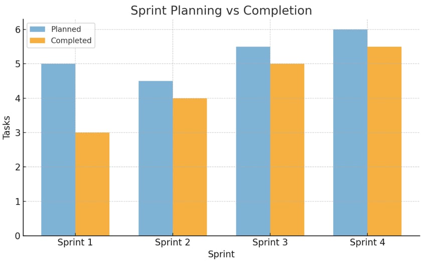
This chart is not only a report, but it also helps you spot velocity fluctuations and guides you on what to commit to in upcoming sprints. Let’s say you completed 30, 28, and 32 tasks in three previous sprints. That gives you an average of 30 tasks. Now you know what’s realistic to plan moving forward.
For example, if your chart shows a drop in one sprint, it might be due to blockers or external factors. If the bars rise steadily, that’s a sign your team is getting better at managing task complexity and delivery.
Axify helps you track velocity through throughput, not story points. It counts completed items like tasks and bugs to give a clear picture of delivery pace. Instead of estimating, it uses real data to forecast how much you can deliver in future sprints. This approach avoids the common pitfalls of velocity metrics, like overestimating progress or cutting corners to meet point targets.
You also get cycle time tracking to see how long work takes from start to finish. This helps pinpoint delays. Combined with deployment frequency, Axify shows how frequently value reaches users.
In the image below, we can see how deliverables are tracked month by month. It shows two teams averaging three and five deliverables per month, with clear trends and spikes in delivery pace. This historical data is key to planning ahead with confidence and keeping work aligned with real output.

Once you’ve got the data in front of you, the next step is knowing how to analyze it.
Reading a velocity report isn’t just about how many items you finished. To really understand your team’s delivery, you need to look beyond the surface. Here are the key parts to pay attention to:
These patterns tell you far more than a simple list of numbers. They show if your planning is accurate, if tasks are getting too complex, or if you’re running into bottlenecks.
Pro tip: Always keep an eye on WIP and cycle time. A sudden drop in velocity might not mean your team is slowing down but that you started more items than usual or got stuck on a few that took longer than expected. The real value in velocity reports comes from asking why the numbers look the way they do.
Tracking velocity metrics gives you a clear, ongoing view of how your team is delivering work. It helps you make better calls about what to take on, when to deliver, and where to improve. Rather than guessing, you get real numbers to guide your plans.
Here are the practical reasons why you should track velocity metrics and how Axify makes it easier:
When you treat velocity as a planning tool rather than a performance metric, you build trust, set smarter goals, and improve delivery without adding pressure. While velocity can be helpful, it typically gets misused, so let’s look at what not to do with it.

Velocity is a key metric in Agile software development. When used correctly, it aids in planning and tracking progress. However, misusing velocity can lead to issues that hinder your team's effectiveness.
Here are common pitfalls to avoid:
It's tempting to think that a higher velocity indicates better performance. However, Goodhart’s Law says:
If you push your team to increase velocity numbers, they might inflate estimates or focus on quantity over quality. For instance, they could split tasks into smaller units to appear more productive without delivering additional value. This approach can compromise the integrity of your metrics and the quality of your product.
Velocity should be considered alongside other metrics such as cycle time and WIP. Focusing solely on velocity can obscure underlying issues.
For example, a consistently high velocity might seem positive, but if cycle times are also increasing, it could indicate bottlenecks or overextension. Balancing velocity with other indicators provides a more accurate picture of your team's health and productivity.
Velocity is designed to measure team performance, not individual output. Using it to assess individual developers can lead to unhealthy competition and discourage collaboration.
For example, if you start comparing velocities among team members, individuals might prioritize their own tasks over team goals, which can harm overall productivity and morale. Prioritize collective achievements to foster a cooperative environment.
Examining velocity figures in isolation can be misleading. It's more insightful to analyze trends over time.
For instance, if velocity fluctuates significantly between sprints, it may signal issues such as an inconsistent workload or process inefficiencies. If you observe velocity trends, you can identify patterns and make informed adjustments to improve your team's workflow.
Here’s how to make your velocity metrics actually reflect the pace and health of your work. You don’t need a full process overhaul. You just need to adjust the way your team flows. Here are the five most practical ways to do it:
If you want your velocity metrics to actually reflect progress, you need more than just raw numbers. Axify helps you see the full picture by tracking team velocities, spotting blockers, and comparing delivery pace across sprints. You’ll get context around what’s slowing things down and where you’re gaining speed.
No more guessing or relying on outdated units of measurement such as story points. With clear dashboards and insights that you can act on, you can focus on what really drives your delivery forward.
Axify gives you the tools to plan smarter, move faster, and lead with confidence. Want clarity in your metrics? Book a demo with Axify today.
