%20(4).png?width=500&name=Mega%20menu%20-%20Vignette%20-%20(241%20x%20156%20px)%20(4).png)


.png?width=60&name=About%20Us%20-%20Axify%20(2).png)
%20(2).png?width=60&name=Icons%20-%20Lookalike%20Axify%20(44%20x%2044%20px)%20(2).png)
%20(1).png?width=60&name=Icons%20-%20Lookalike%20Axify%20(44%20x%2044%20px)%20(1).png)
Software Development
14 minutes reading time

See exactly how AI impacts your team's performance.
-3-1.png?width=60&name=Icons%20-%20Lookalike%20Axify%20(5)-3-1.png)
AI decision partner helping engineering leaders with actionable insights.
Real-time tracking and insights into DORA metrics.
Detailed visual maps of your entire software development process.

Help development teams monitor and benchmark their productivity.
Improve your software engineering with accurate metrics tracking.
Set inspiring objectives and track their progress.

80% of IT professionals say their environments are becoming more complex than they were before. And you’ve likely felt that too, already: more tools, more dependencies, and more pressure to explain what’s actually slowing delivery when results don’t match expectations.
But access to data is rarely the issue. Deciding which data and metrics matter when everything looks urgent is what actually slows your decisions.
So, in this article, you’ll see how to use CIO dashboards in real case scenarios and which metrics actually support decisions. You’ll also see where teams get it wrong and why that causes more issues.
Pro tip: Axify Intelligence can show you where your delivery slows, explain why, and suggest what you should change next to fix it. Contact Axify to see it on your own data.
In 2026, software development teams can easily access dashboards with good enough visibility of traditional metrics. Tools that offer AI impact visibility and decision systems are harder to find.
And the truth is, today AI tools are actively changing workflows, strategies, and even team roles. You now need to understand how AI adoption affects cycle time, throughput, and quality, and where it introduces new delays.
At the same time, you need dashboards that act as decision partners. These tools can help you understand what changed, why it changed, and what action to take next without waiting for manual analysis.
This article reflects those two pain points. We’ve added more useful CIO dashboard examples and metrics, plus a more in-depth section on how to create a CIO dashboard.
But before we get into that, let’s establish the basics.
A CIO dashboard in software development is an executive-level view of how work moves from idea to production and how that movement impacts business outcomes. It consolidates signals from systems such as Jira, GitHub, CI/CD pipelines, and incident management into a small set of delivery indicators.
Its purpose is to evaluate how efficiently and reliably software is delivered.
Unlike team dashboards, which focus on execution details such as sprint velocity, ticket completion, or pull request counts, a CIO dashboard answers system-level questions:
The difference is in how data is structured and interpreted.
For example:
This allows leaders to identify constraints. If review time consistently exceeds coding time, the constraint is in ownership or review policies. If deployment frequency increases alongside failure rates, the issue is not speed, but insufficient validation or release control.
Here are some core features you should expect:
This leads us to the benefits of using this dashboard.
TL;DR: This centralized dashboard lets you gain real-time insight into your daily operations and have complete visibility of your IT performance. This leads to more informed decision-making. You can more easily align your IT initiatives with your overall business goals.
Let’s break these advantages down:
A CIO dashboard may show delivery trends, risk, cost, and AI impact, but you still need to connect those signals and decide what deserves attention first.
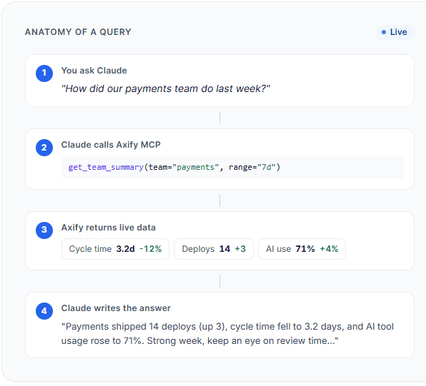
That’s where Axify’s MCP server can help.
It lets you query live Axify data from supported AI clients like Claude, so you can ask follow-up questions such as: “Which teams improved cycle time but increased review load?”
or
“Where did AI adoption increase without improving delivery?”
Instead of manually comparing several dashboard views, you get a permission-scoped answer based on your engineering data.
Here’s how it works:
We've seen dashboards that look impressive but don’t help you decide anything. The ones that matter are the ones you actually go back to when something feels off.
Let’s look at some examples below.
An AI impact dashboard shows how AI usage affects delivery performance over a defined period (for example, the last 4-8 weeks at the team or product level).
You might see:
Example:
If AI adoption increases from 40% to 70% over 6 weeks, and cycle time drops from 6 days to 4 days in the same teams, you can link adoption to faster delivery. If the change failure rate stays stable, it shows speed improved without reducing quality. This supports a decision to expand AI usage to other teams.
Incorrect use: Tracking the number of AI licenses or logins alone.
Why that’s wrong: Usage-related metrics don’t show whether your performance actually improves. You need to track delivery metrics before and after AI adoption to assess its effects.
Pro tip: Axify’s AI Adoption and Impact feature connects adoption data with delivery metrics, compares performance with and without AI, and highlights which teams and tools are driving measurable improvements.

An executive dashboard shows how delivery performance affects business outcomes, reviewed at the product, portfolio, or company level over a consistent period (for example, monthly or quarterly).
You might see:
Example:
If the lead time for changes increases from 4 days to 8 days in a quarter, and customer-reported issues increase by 25% in the same period, you can connect slower delivery to customer impact. This supports a decision to reduce work in progress or address bottlenecks in the delivery pipeline.
Incorrect use: Reviewing delivery metrics and business metrics in separate reports.
Why that’s wrong: You cannot see how delivery performance affects business results.
Pro tip: With Axify Intelligence, you can see what changed in delivery performance, understand the causes (for example, growing review queues), and get specific recommendations tied to workflow decisions.

A delivery dashboard shows how work moves from start to production, using a consistent time window (for example, weekly at the team level).
You might see:
Example:
If deployment frequency stays stable at 5 deployments per week, but lead time for changes increases from 3 days to 7 days, you can look at flow metrics and see that work in progress doubled, and review time increased by 60%. This shows that work is piling up before completion. It supports a decision to limit work in progress or rebalance review ownership.
Incorrect use: Tracking deployment frequency alone.
Why that’s wrong: Frequent deployments may look good on paper, but they don’t show how long work takes or if/ where delays occur.
Pro tip: Axify tracks both DORA and flow metrics across teams, breaks down cycle time into stages like coding, review, and deployment, and shows where work is waiting or slowing down so you can act on specific constraints.
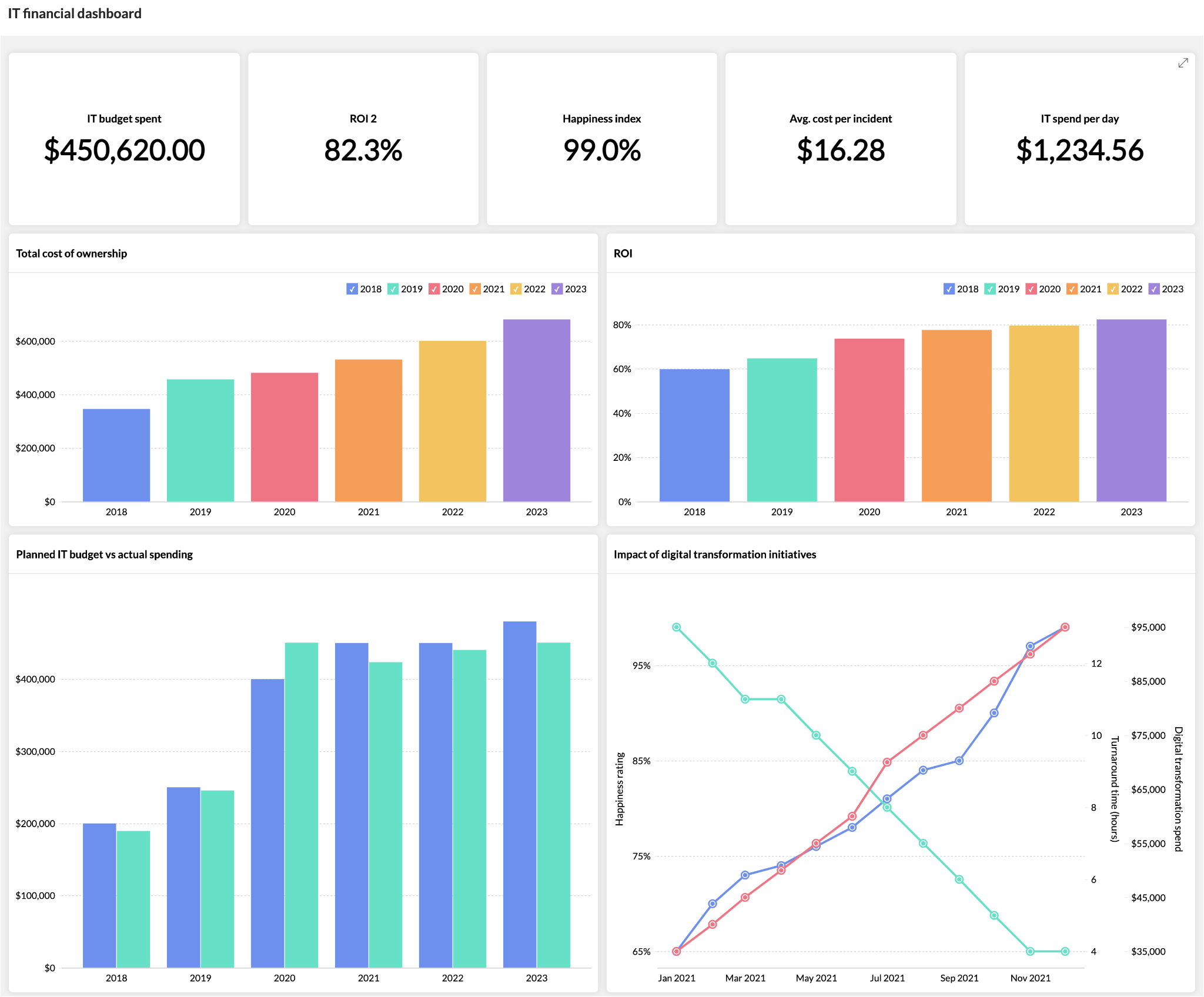
A financial dashboard shows how delivery performance translates into cost over a fixed review period (for example, the last quarter at the portfolio level).
You might see:
Example:
If the lead time for changes increased from 5 days to 9 days in Q2, and the cost per feature also increased by 40% in the same period, you can link slower delivery to higher delivery cost. This supports a decision to reduce work in progress or rebalance team capacity.
Incorrect use: Tracking total IT spend without linking it to delivery output.
Why that’s wrong: You can’t tell if the higher cost comes from inefficiency or increased demand.
A security dashboard tracks how quickly issues are detected and resolved, using a consistent time window (for example, weekly at the system or product level).
You might see:
Example:
If MTTR increased from 1 day to 3 days over the last month while deployment frequency stayed stable, it shows the team is shipping often but taking longer to fix issues. This supports a decision to adjust incident ownership or reduce parallel work.
Incorrect use: Tracking the number of vulnerabilities without resolution time.
Why that’s wrong: Volume alone doesn’t show how quickly risk is reduced.
This dashboard focuses on operational workload and support flow, usually reviewed weekly at the team level.
You might see:
Example:
If one team handles 40% more tickets than others but has a 2x longer resolution time, you can identify an imbalance in workload distribution. This supports a decision to reassign tickets or adjust team capacity.
Incorrect use: Tracking individual technician performance as a ranking system.
Why that’s wrong: Ticket resolution depends on system complexity, dependencies, and incoming volume.
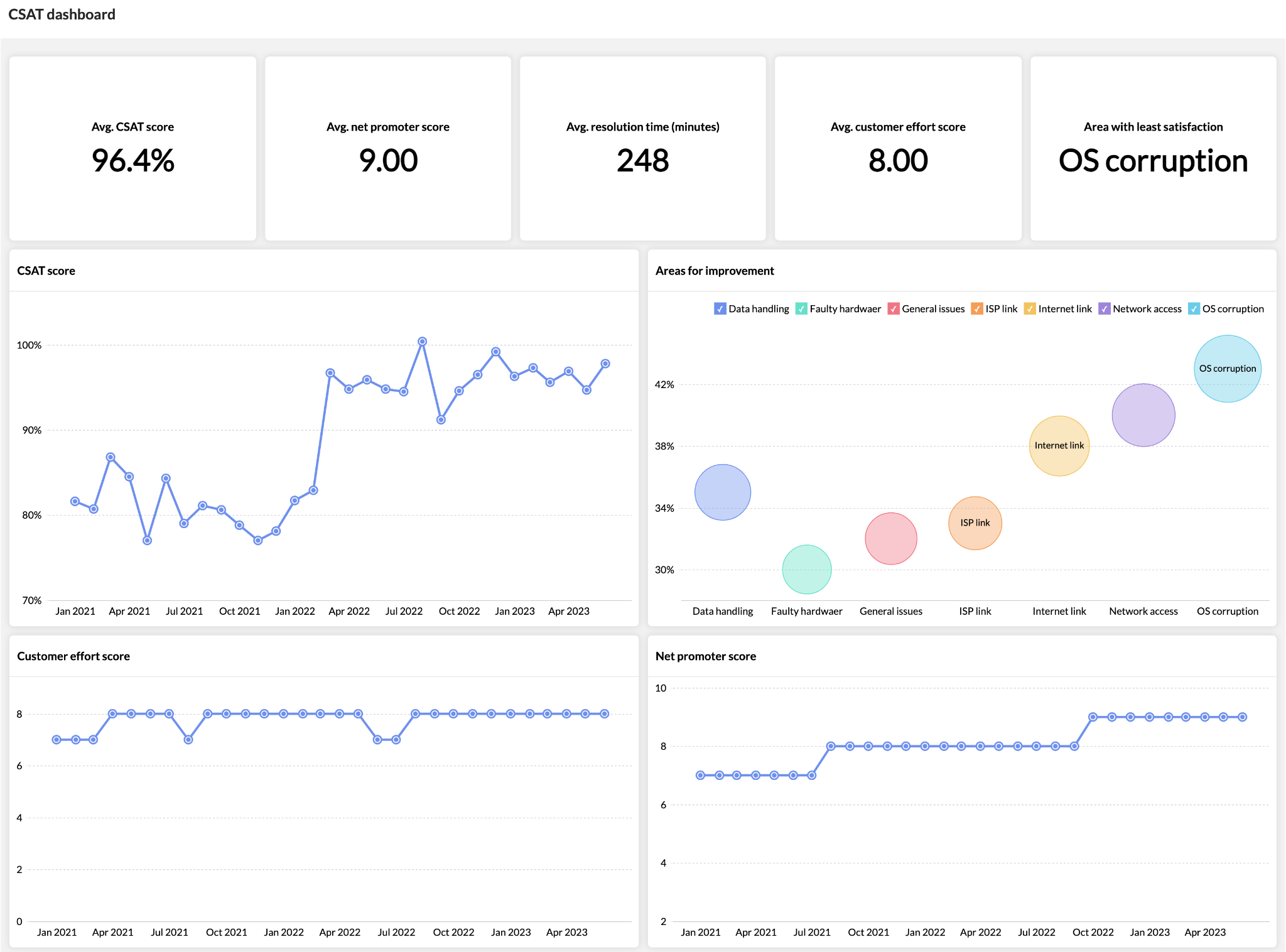
A CSAT dashboard shows how users perceive IT performance over the same period as delivery metrics (for example, monthly at the product level).
You might see:
Example:
If deployment frequency increased from weekly to daily in the last month, but CSAT dropped by 15% in the same period, it shows that faster delivery is creating issues for users. This supports a decision to review the change failure rate or testing practices.
Incorrect use: Looking at CSAT alone without delivery context.
Why that’s wrong: Satisfaction changes without explaining what in the delivery process caused it.
All of this leads us to who can use this dashboard.
You might be the one accountable for delivery, or the one asked to explain it. Either way, we think you need the same things: a clear view of what’s happening and what to adjust next.
A CIO dashboard is used by different roles, but not in the same way. The difference comes from what decisions each role is responsible for.
CIOs review dashboards at the product or portfolio level, usually weekly or monthly.
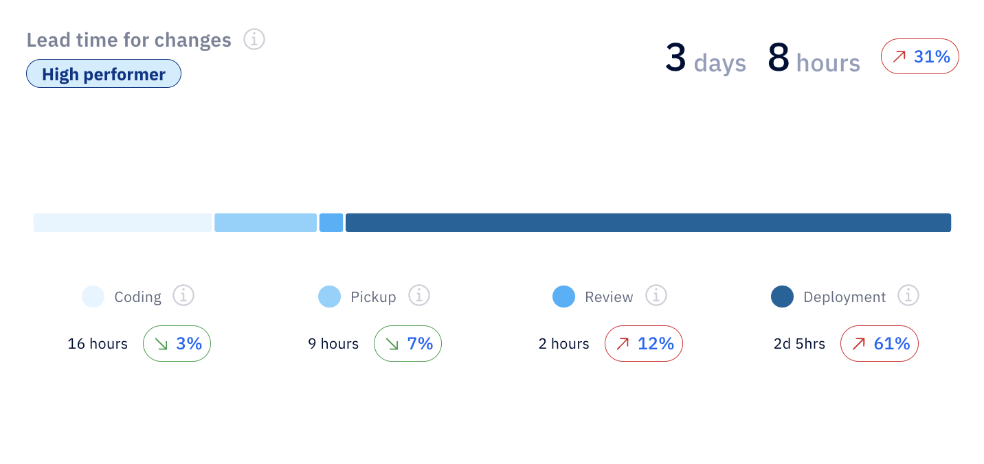
In this capacity, you’re looking at how delivery performance connects to business outcomes. For example, a dashboard view might show lead time for changes alongside customer support volume over the same quarter. If both increase at the same time, it points to delivery delays affecting customer experience.
You can also break that lead time for changes to see where the delay comes from. In this case, review and deployment time are increasing, which signals process or release bottlenecks. Many CIOs might think coding speed is the issue here, but from our experience, it’s not.
The focus is on:
This supports decisions about investment, prioritization, and trade-offs across teams.
Senior IT leaders use the same data but at a more detailed level, typically by department or group of teams, reviewed weekly.
If that’s you, use the CIO dashboard to understand patterns. For example, an Axify view might show that self-reviewed pull requests increased by 49%, with several PRs not reviewed each week. That points to gaps in the review process, where work is moving forward without proper validation.

ALT: Self-reviewed pull requests rising, showing gaps in review process.
Senior IT leaders are tracking the following metrics in CIO dashboards:
This supports decisions like reassigning ownership, adjusting workflows, or reducing parallel work.
IT managers mainly use the team level view, and monitor the CIO dashboard daily or per iteration.
In your role, you’re mainly interested in the flow of current work. A typical view might show how work in progress changes week over week. For example, let’s say WIP is dropping by 39% to around 5 active issues.

ALT: Work in progress trends showing 39% drop and improved delivery flow.
That tells you work is being completed faster than it’s being started, which most likely reduces your delays and improves flow. If WIP starts increasing instead, it signals overload, where too many parallel tasks slow down delivery.
CIO dashboard metrics you should be tracking as an IT manager include:
This is where the dashboard directly shapes day-to-day execution.
For business leaders, the CIO dashboard is about the business impact of your initiatives. This is reviewed monthly or quarterly.
That’s why you need CIO dashboard views that connect delivery trends with business outcomes. For example, deployment frequency increasing by 82% over three months shows that teams are deploying changes more often.

ALT: Deployment frequency trend showing 82% increase and delivery growth.
This acceleration supports faster feature rollout and quicker response to market demand.
Now, let’s say you also notice a higher feature adoption or revenue growth; this confirms that, indeed, your delivery improvements are translating into business results. If you don’t notice better business results, there’s a worrying gap between output and actual impact.
We advise business executives to follow these metrics:
This approach supports decisions about funding, priorities, and expectations from IT.
With that in mind, let's see how you can create a useful, relevant CIO dashboard for your role.
By now, you’ve seen what a good dashboard looks like. But the harder part is building one that you actually use when decisions need to be made.
Most dashboards fail because they collect data without defining how it will be reviewed or used. In the steps below, we'll focus on that part.
Start with the decisions you need to make instead of focusing on the (possibly unnecessary) data you already have.
At the portfolio or product level, define a small set of business-aligned KPIs that connect delivery performance to business outcomes over a fixed period (for example, monthly). This usually includes a mix of:
From our experience, a good pattern is to pick 5-6 metrics across several dimensions that you review consistently. And a bad pattern is adding more metrics “just in case,” which leads to dashboards that are checked but not used.
For example, tracking lead time and support tickets over the same month helps you decide whether slower delivery is affecting customers. Tracking lines of code does not support any decision at this level.
Next, we recommend making sure the data comes from the actual systems that track your team’s work.
This means connecting tools that reflect your IT infrastructure: issue tracking systems, deployment pipelines, incident management tools, and support platforms. The goal is to measure real activity.
All metrics must use the same definitions and time window. If lead time is calculated weekly but incident data is reviewed monthly, the comparison isn’t relevant.
In our experience, the right setup pulls data automatically and updates it continuously. An incorrect one relies on manual exports or spreadsheets, which can be incomplete or introduce errors, and therefore, reduce trust.
This is also where a platform like Axify can help.
It connects to the systems your teams already use, including Jira, Azure DevOps, GitHub, GitLab, and coding assistants, then turns delivery activity into consistent engineering metrics. Instead of rebuilding reports manually, you get a shared view of delivery performance, bottlenecks, and trends.
The same dashboard should support different levels of review, but not with the same view.
At the CIO level, you look at trends across products or business lines. At the team level, you look at flow and execution. The structure stays consistent, but the level of detail changes.
For example, a CIO might review delivery trends alongside customer impact. An IT manager will look at cycle time and work in progress to improve operational efficiency within a sprint.
If every role sees the same level of detail, the dashboard becomes either too abstract or too operational. Both cases reduce your CIO dashboard’s usefulness.
Once the dashboard is live, the real work starts.
We advise you to review it on a fixed cadence (weekly, monthly) and use it to make actual decisions. If a metric changes but no action follows, the issue is how the dashboard is used.
A practical approach is to test it in real scenarios. For example, if system reliability drops and recovery time increases, can the dashboard show where the delay happens? If not, it needs adjustment.
Pro tip: We strongly believe that dashboards should evolve with your organization, especially as priorities shift during digital transformation or changes in software quality standards. The goal is not to build a perfect dashboard once, but to keep it relevant as decisions change.
CIO dashboard metrics should help you decide where to invest, what to fix, and what to stop. If a metric doesn’t support a decision tied to your strategic objectives, it becomes irrelevant.
Here are the key performance indicators that consistently support real decisions.
This category of metrics tracks speed of delivery. Here, you can track:
Velocity tracks how many work items are completed over a fixed period, usually weekly at the team level and reviewed monthly at the portfolio level.
Most stable teams operate within ±10% of their rolling average. When variation goes beyond that, it usually signals shifting priorities or dependency issues.
Example: If throughput drops from 45 to 30 items per week over a month while work in progress increases, your team starts work that it doesn’t finish. This points to flow constraints and not a lack of effort.
Why it matters: It helps you assess delivery stability, which is critical for planning and performance benchmarking across teams.
This metric shows how long it takes for a change to appear in the production environment by measuring the average time between the first commit in the development environment and when that change is successfully running in production.
Example: If lead time for changes increases from 4 days to 9 days in a quarter, and feature adoption drops from 60% to 40% in the same period, you can link slower delivery to fewer users activating new features.
Why it matters: It shows how efficiently your engineering system moves changes to production and where delays occur inside the workflow.
This measures how long it takes for a business idea to reach users and generate value. It includes discovery, prioritization, development, and release.
Unfortunately 31% of software projects are delivered on time and within budget. Not following Agile best practices is typically the cause because companies that adopt Agile see 60% faster time-to-market.
Example: If time to market increases from 3 months to 6 months while lead time for changes remains stable, the delay is not in engineering execution but more likely in upstream stages such as prioritization or decision-making.
Why it matters: It reflects how quickly your organization can respond to market demand and deliver value to customers.
Flow efficiency measures how much of the total time is spent actively working versus waiting. In most environments, it ranges from single digits up to around 15%.
Example: If a feature takes 12 days to complete but only 2 days are active work, you need to identify and streamline delays in reviews, handoffs, or queues.
Why it matters: It shows where time is lost inside your workflow and gives a direct signal of IT performance and bottlenecks.
These show how effort and budget are distributed; they help you understand where your resources are going.
This tracks how your budget and capacity are distributed across types of work, reviewed monthly at the portfolio level. A common split might be 60% new features, 30% improvements, and 10% bug fixes.
Example: If bug-related work grows from 10% to 35% over two quarters, you’re likely facing declining system health or rising technical complexity.
Why it matters: It shows whether your capacity is spent on new features, improvements, or fixes, so you can shift effort when too much time goes into maintenance instead of delivering new value.
Work in progress (WIP) measures how many items are actively being worked on at the same time.
Example: If WIP doubles while throughput stays flat, cycle time will increase. This means more parallel work is slowing delivery.
Why it matters: It helps control overload and improve flow, which directly impacts delivery speed.
AI introduces a new layer of performance metrics that need to be tied to delivery outcomes.
You should track:
Example: If AI adoption increases from 50% to 75% over six weeks, and cycle time drops by 20% while quality remains stable, you can link AI usage to faster delivery.
As we mentioned above, tracking AI usage alone is a major mistake. Usage does not show whether the AI solutions you implement actually improve outcomes.
P.S. Axify connects these AI metrics with delivery data, so you can compare performance across teams and confirm whether AI improves speed, quality, and overall delivery.

Most CIO dashboards track activity and outcomes. That kind of visibility is good, but you also need to understand what is actually improving delivery, where money is being wasted, and what to change next.
As we hinted before, you need decision support. Our executive view in Axify helps you with:
At the executive level, metrics only matter if they connect to cost, capacity, and delivery outcomes. That’s how Axify frames them:
Each of these metrics ties back to one question: where is delivery slowing down, and what does that cost the business?
AI adoption may look promising on paper. But the real question is whether it changes delivery outcomes.
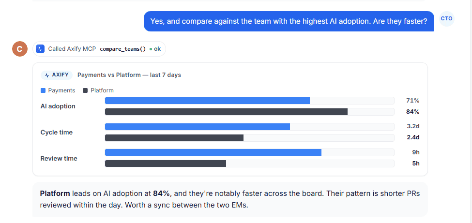
Axify connects AI usage with actual results in your company across teams and workflows. For example, let’s say your AI-assisted tasks move faster but review queues grow. In this case, you moved your delays to the review stage instead of solving the true bottlenecks causing them.
This level of visibility and understanding changes how you make decisions because you now know:
In other words, you and senior leadership sees where AI contributes to cycle time, throughput, and quality, and where it doesn’t.
Remember: Axify’s MCP server can also make that data easier to access from the AI tools you already use. For example, a CIO could ask Claude, “Which teams increased AI adoption last month but also saw review time go up?” or “Summarize delivery performance and AI impact across our platform teams this quarter.” Claude can then query Axify through MCP and return a permission-scoped answer based on live engineering data.
Most CIO dashboards stop with good visibility. So, the harder part is knowing what to do next.
Axify Intelligence works as a decision layer on top of your delivery data. It continuously analyzes patterns across the pipeline and turns them into actions in four easy steps:
This shifts the role of the CIO dashboard. It’s no longer a place to check numbers; it becomes a system that helps you decide what to fix, where to act, and what impact to expect.
With Axify MCP, those follow-up questions can also happen inside Claude and other supported AI clients. Leaders can query DORA metrics, cycle time, AI adoption, review time, team health, and packaged summaries without manually moving between dashboard views. The MCP server is read-only at launch and follows the same permissions already set in Axify.

Here are some common challenges in implementing CIO dashboards:
Axify addresses these challenges with its solid features:
For most CIOs, the problem isn’t a lack of data. The problem is knowing what actually deserves attention right now and what can wait.
A CIO dashboard only becomes valuable when it helps you move from observation to action. Instead of reviewing reports and asking teams to investigate, Axify shows what changed, why it changed, and what to do next.
That shift reduces back-and-forth, shortens decision cycles, and keeps teams focused on what impacts delivery.
If faster, clearer decisions are the goal, it’s worth seeing how this works in practice. Book a demo with Axify today and start implementing a more effective IT strategy.

CIO dashboards support business decisions by connecting delivery performance, risk, and cost to real business outcomes in one place. That means you can see how delays, incidents, or changes in throughput affect revenue, customer experience, or operational load.
The metrics that matter most for CIOs are those that link delivery performance to cost, risk, and business impact. This usually includes lead time for changes, deployment frequency, change failure rate, flow efficiency, and resource allocation.
The difference between operational and executive dashboards is the level of detail and the decisions they support. Operational dashboards focus on team-level execution, like cycle time, work in progress, and blockers. Executive dashboards focus on trends across products or portfolios to connect delivery performance to business outcomes
CIO dashboards should be reviewed on a consistent cadence, typically weekly for trend monitoring and monthly for strategic decisions. This keeps signals aligned with how delivery and business metrics evolve.
Axify is different because it acts as a decision layer. Unlike a traditional reporting tool, it shows you what changed in your delivery performance, explains why it changed, and recommends what to do next based on your actual workflow. This reduces the disconnect between insight and action, which is where most dashboards fall short.